What is A Style Guide?
In order to build a distinctive brand that feels authentic, cohesive and truly stands out, you must go beyond just designing the logo and have a more holistic approach. You need a more comprehensive style guide or brand guidelines. The main difference between a style guide and brand guidelines is that a style guide usually refers to something shorter and more visually focused on the design direction. The brand guidelines, on the other hand, usually refers to something larger but both terms could be interchangeable.
The Style Guide
The style guide is a document that provides guidance on how to keep your brand identity consistent with a cohesive look and feel. It outlines the various visual elements that allow people to identify and differentiate your brand. You don’t need to be a large company to have a style guide. A style guide reflects your brands integrity and shows your commitment to the best of quality design.
The Brand Guidelines
The guidelines or brand guide has the same function as the style guide but it usually refers to a more detailed and extensive document containing other information such as your brand story, mission statement, vision, customer persona and core values.
The Design System
The design system is much broader and refers to the components/patterns you use to put together a website or app, as well as the principles that function together as a cohesive system. It is also sometimes referred to as the “design language.” It comes with the semantics and directions on how to use the pieces correctly so the guidelines or style guide could be a part of it. Everything could also be accessed from a reference site. Some well-known examples are IBM’s, Shopify Polaris and Google’s Material Design. This is usually for much larger brands or companies looking to scale quickly.
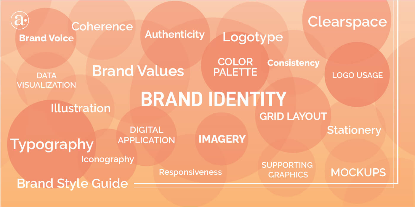
What is in a Style Guide?
Think of a style guide as a plan of how you will use design to convey your message effectively and represent your brand. It can also be seen as an extension of your brand strategy or simply a cook book with the visual elements that bring your brand to life in a way that is recognizable and meaningful. What a style guide contains may vary, depending on your brand and the kind of elements that are most appropriate. But below are the most basic fundamentals that every style guide should have. You can also find some style guide examples on brandingstyleguides.com.
1. The Logo and Variations
The logotype is the tip of the iceberg. It is what people use to recognize your brand in a crowded marketplace. Anything that has your logo on it should create a perception of superior quality. It should build trust through recognition.
It could be a wordmark logo, lettermark, an emblem, symbol or even a character. A lot of times your brand will be viewed through mobile so the logo should also be responsive or easily identifiable at smaller sizes. It should also come in different variations or lockups. Click here to learn more about how to decide on the right logo for your brand.
2. Directions on How to Use The Logo
The style guide must also contain instructions on how to use the logo. The clearspace section outlines the spacing that should be left around the logo to prevent it from looking too busy. There is also a section that outlines the incorrect ways to use the logo. This way you can prevent people from stretching it or manipulating it in ways that degrade it.
3. Typography
This section outlines your brands typographic approach. Do you ever notice how some brands tend to use certain types of letters? That is because their design direction has already been established to help you recognize them. The style guide contains the names of the fonts being used on the logo as well as what fonts are used for headers and body copy in both online and print. It could also be more detailed and include a grid system for layouts.
4. Color Scheme
The color scheme/palette section outlines the kinds of colors that are used by your brand in a way that is consistent with its tone and personality. It provides all the color codes for reference as well as how the colors are used strategically in both online and in print scenarios. It could also consider factors like accessibility and how the colors fit the target customers. Click here to learn more about how to use color in branding.
Ideally there would be primary and secondary colors as well as accent colors for drawing attention to important elements in a design. It could also have background colors. Everything helps to hold the scheme together. That way people do not forget and use the wrong tones. For example, if your brand is very calm and soothing, you will not want to use colors that are very energetic and excited.
5. Iconography
Icons can also be an essential part of your brands visual identity. Icons help you communicate the brands concepts, benefits and offerings in a simplified way that is easy to identify. Especially now in the digital age, icons must be highly scalable. Icons are used in websites and on business cards. Brands on Instagram also use icons for stories.
6. Imagery
Your approach to imagery is also important. People should be able to identify your brand because of the kinds of images you use. This section contains the kinds of imagery that are used or not used by your brand. This is especially important for creating social media content, advertisements, websites and fashion lookbooks. Everything will need to be consistent with its overall look and feel. Consider what kinds of images will help you tell your brand story and convey the right message. To learn more about brand imagery, follow this link.
7. Mockups
These sections show how your logo looks in various scenarios. It can show your logo on clothing or on various forms of merchandise and promotional products. This way you can see how cohesive everything looks and present the new visual identity to stakeholders.
Other elements that can be included in a style guide are brand tones, responsiveness, supporting graphics(e.g. patterns) and illustrations. I can help you decide on what design elements would allow you to present your brand and your messaging more effectively and cohesively. Below are some style guide examples.
Style Guide Examples
Here are 5 industry standard style guide examples from different industries to inspire your branding projects.
LOKA Energy
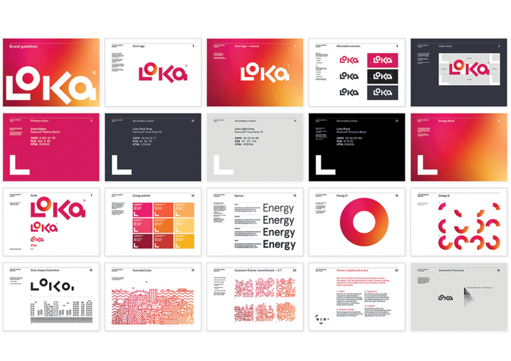
The Loka Energy style guide uses a very bold and geometric logotype that is inspired by the Greenwich Peninsula Identity. The brand identity is overall very dynamic, flexible and full of energy using warm colors, geometric illustrations and supporting brand assets that make it stand out.
To learn more about this project, click this link to take a look at the case study.
Created by: Believe in Design
IG: @believeindesign
www.believein.net
We Work
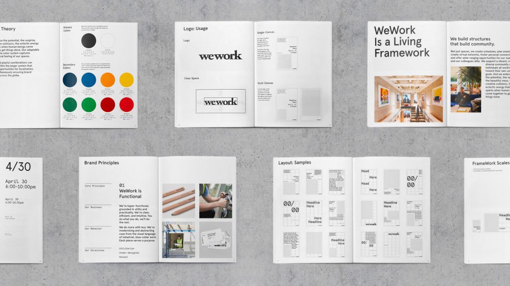
The We Work design approach reflects the unique balance between structure and flexibility. The design direction also includes typographic grids and layouts to maintain consistency. As a large company, The style guide allows them to maintain a solid but flexible framework while communicating on a global scale.
You can learn more about this project by clicking this link.
Created by: Gretel NY
IG: @gretelnyc
www.gretelny.com
Medium
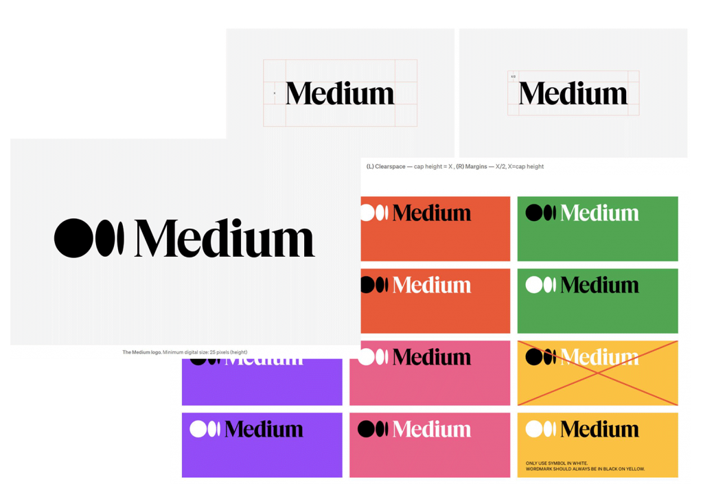
The Medium wordmark is inspired by magazine and newspaper editorial mastheads as a reference to traditional print publishing. The visual identity is timeless, cohesive and fresh. It adapts a traditional approach to more modern digital media in a way that is very well executed.
To learn more about this project, click here and visit the site.
Created by: Manual Creative
IG: @manual_sf
www.manualcreative.com
NJORD Organic Restaurant
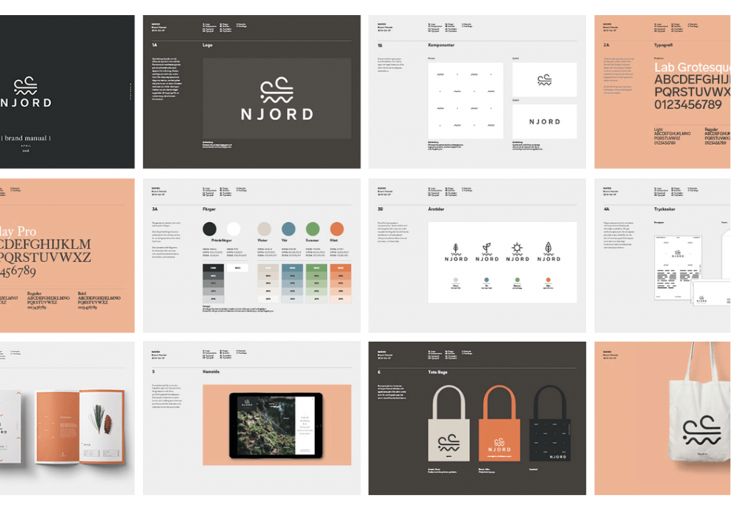
Njord brand identity is about combining seasonal and local with Nordic cuisine. It uses a very abstract approach to symbolism combined with a color scheme that reflects the transitions between Nordic seasons. The concept reflects themes like sustainable production and eco-awareness.
To learn more about this project, click this link to view the case study on Behance.
Created by: Nicklas Hellborg
IG: @nhellborg
www.nicklashellb.org
Luxe by CC
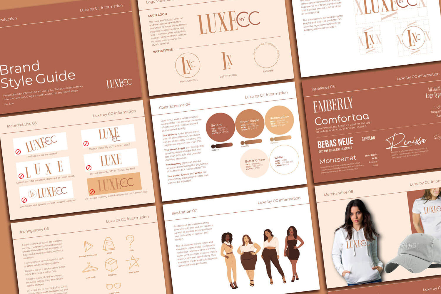
Luxe by CC is a premium women’s apparel brand. The design direction can be described as upscale urban but casual, clean and edgy. A distinct illustrative style is used to convey the beauty in diversity, self-love and acceptance.
Why You Need A Style Guide
1. Go Beyond Just A Logo
You can’t fully convey what your brand is about with only a logo and tagline. You need a more systematic approach that looks at every point of interaction with your brand. A style guide enables you to more effectively convey your message through various media.
2. More Cohesiveness
The style guide helps you create a more cohesive brand experience through consistent interfaces, imagery, colors, etc. A cohesive brand is an authentic brand that will stand out as more memorable.
3. Recognition Brings Trust
A style guide helps you create a brand that is easier for people to recognize because it has a more authentic look and feel. They recognize not only your logo but your color scheme, style of illustration, style of lettering and other elements that make up your brand. Over time, that recognition will bring trust among customers.
4. Compete at a Broader Scale
For brands looking to compete at a broader scale, you may be hiring different agencies and freelancers across the country or world for your design. This can cause your brand to look inconsistent, saturated and confusing. The style guide serves as a reference point to guide all their design work. This way everything fits together as a whole.
5. More Efficiency
The style guide helps to speed up the design process among teams because the design direction has already been established. Lesser revisions will also be needed. The style guide can be stored on the cloud along with other brand assets that people can refer to.
6. Presentation Tool
The style guide can be shown internally as well as externally as an excellent presentation tool. It shows your commitment to quality and reflects your brands integrity. Overall it improves perceptions of your brand. It can be in PDF form or made into an interactive flipbook. Brands also sometimes create separate web pages or sites where anyone can visit and view their guidelines or download assets. This way everyone can learn more about their message and how it is expressed through design.
In conclusion, it’s time to take your brand to its next level and really bring your vision to life with a full style guide that tells your story in a more holistic and cohesive way that builds recognition and trust. If you have a project that you would like to launch, feel free to click here and let us discuss it. If you enjoyed this article, you may also like my previous one on why your company may need a rebrand.
To view some more style guide examples you can also visit brandingstyleguides.com

3 Responses
I’ve come across many blogs, but this one truly stands out in terms of quality and authenticity Keep up the amazing work!
Your blog post was fantastic, thanks for the great content!
The design and layout of this blog are so aesthetically pleasing and user-friendly It’s a pleasure to navigate through