In its simplest form, the main purpose of a business logo is to help customers identify your brand in a crowded industry. Logos help you build the right associations with your brand and can be very effective if used in the right way. They should also be looked at from a broader context because it is really about making sure your brand, as a whole, stands out and communicates effectively through every point of interaction. Below I have listed 10 factors to look out for when deciding on a more effective business logo.
1.) Context of Use
Before the design phase you must consider the various ways the logo is going to be used and the design must be able to work in various scenarios. It also needs to be provided in the right sizes and formats after it has been decided on.
For example, If you plan to use the logo for social media then It should also fit nicely into a small circle because it will be used for a profile pic. Another example is if you plan to print it on shirts then the design must work in fewer colors depending on your printing budget. Most printers charge per color so if the logo can work in only one color then that could save you a lot of money. Also the color of the logo should contrast the color of the whatever it is being printed on.
If you plan to make pens then the logo must be able to work across a small pen. Other examples are embroidery and signage. What kind of signage do you see your logo on? Also, If you plan to create vehicle-wraps with your logo then it must use colors that are easy to spot at night and easier to remember if your vehicle flashed by. You might also need to look at mockups to give you a preview of how your logo will work in various scenarios.
2.) Appropriateness
The truth is that it is not about how pretty the logo is but what really matters is how appropriate the design is for your brand, industry, and what you are trying to convey to your target audience. If it is not appropriate to your brand and the strategy then it does not matter.
For example if the brand is aimed at an older audience then it can’t use certain colors because older people tend to have vision impairments. They would also have a problem with low contrast colors overlapping each other. Also if the brand is aimed at teenagers then it would need to look younger. If it is aimed at older people then it would look more mature.
Are you a luxury brand? Are you a tech company? Your logo must reflect what you are trying to convey about your brand. You need to set a criteria to determine what makes a logo appropriate or not. What kind of look are you aiming for? What are you trying to avoid? The business logo that is more appropriate determines which is more effective.
3.) The Swap Test
One way to determine the effectiveness of a logo is by replacing your symbol with a competitors symbol or placing your symbol with a competitors wordmark. If your brand symbol looks like another competitors symbol could easily fit in its place then it is too generic. This test was made popular by Marty Neumeier in his book ‘The Brand Gap. Your wordmark and symbol should be designed to fit each other in a way that no one else can replace.
4.) Memorability
An effective business logo must also be memorable. You can have mnemonic elements in your logo to help people remember it. But research by Siegel+Gale discovered that what makes a logo memorable is its simplicity. Avoid unnecessary elements such as drop shadows, glitters, overly complex details and things that make the logo look tacky. At the same time, avoid being too simple that the logo doesn’t stand out in a crowded marketplace. You want your message to be conveyed both visually and verbally in a simplified and memorable way.
5.) Differentiation
In a highly competitive marketplace, does your logo look too much like others in your industry? Logo design should be based on research to understand how other competitors present their brands. You might discover that your current idea or even the color has already been used multiple times and this can make your brand look like a commodity. This can also lead to legal cases against your brand if you use an idea that has already been trademarked and patented. Avoid looking like everyone else or being a ‘me too’ brand.
6.) The logo must work in black and white
An effective business logo should not rely on color to look appealing. It must work well in both black on white and white on black. Before deciding on the right logo, you need to review the concepts in white on a black background and in black on a white background, as well as in 1 color. This would also help you to avoid bias because sometimes you may like a concept but it is really the color that you are attracted to. The logo that works better in B/W will have a stronger sense of form that allows it to stand out more. If your logo does not work in these formats then it may also lead to further issues down the road.
Also, keep in mind that white lines in a design may appear thicker on a black background, compared to black lines on a white background.
Also, a black design on a white background may appear to have more spacing compared to a white design on a black background. These optical illusions can really affect the visual appearance of your logo so it is important to consider them because your logo might appear slightly differently when placed in black on white vs white on black.
7.) The logo must work in smaller sizes
Your business logo must also be able to adapt to both small and large displays. Below you can notice how the Coca Cola, Chanel and Nike logos all work in both small and large sizes. You need to have different variations of your logo that allow it to work at smaller sizes.
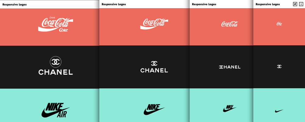
source: blogartesvisuales.net
8.) The Logo Must Evolve
A logo should not be seen as a small static mark that does not change. Instead, it should be seen as an identity that is evolving over time to keep up with a rapidly changing world. As your brand evolves your logo should also evolve. The design you choose for your logo is not a final decision that you must use forever. Consider updating your logo every 7yrs to improve it and stay fresh. Below is the evolution of the Volkswagen and Starbucks logo over time.
9.) The Logo As A System
The logo should not be seen as a small static mark that goes in the corner of a website or advertisement. Instead it should be approached as a whole flexible and dynamic system of visual expression. The logo that works better as a system is going to be more effective because it is looked at in a broader context. For example, how does it allow for more creative advertising and brand expressions? Click here to learn about how you can use a style guide to create a more cohesive visual language.
If you plan to extend into sub-brands and categories then you need to consider how the logo translates. Fedex uses their visual identity to creatively convey their various subsidiaries through color codes. There are many ways a logo can behave dynamically. It can stretch, point, form patterns or break down into abstract shapes and symbols. It can also animate or act as a container for branded content.
The Louis Vuitton Logo is a simple lettermark that is able to work as an elegant system of patterns that aid brand recognition, especially when used with the color brown to convey the premium luxurious quality of the product. It was designed by his son Georges Vuitton and today it is one of the most iconic visual identities in the world of luxury.
The Saks Fifth Avenue logo, designed by Michael Bierut, breaks down into a typographic system made of cut-up letters which are used for bags and other forms of branded merchandise.
There are lots of other ways to make a logo more systematic and dynamic. How does it interact with photography? How can your customers interact with the logo? Some brands also develop a brand character in order to make their brand more dynamic because the character can have different poses, expressions and move freely.
Some brands also use creative algorithms to make the logo generate itself or adapt to changes in its environment like a living entity. One example is the identity system below for the Nordkyn Peninsula in Norway which adapts itself based on real-time data input from its environment winds and temperature. It was designed by Neue Studio. You can learn more about the art direction by following this link.
10.) Beware Of The Subliminal
There are many cases of subliminal negative associations ruining a successful rebrand. The subliminal meanings can either improve a logo if used cleverly or degrade it without you even knowing. Your logo might convey something false, negative or offensive subliminally. For example, if your logo has references to water then you might want to avoid reds and yellows because that might cause it to look like bodily fluids. You also need to make sure that letters don’t spell out something different. What do you think of the new KIA logo that looks like KM? One example of a logo with negative associations is the widely-critiqued Pepsi logo which also looks like a fat belly.
At the same time, you can also convey something positive subliminally in order to make it more interesting. This is called Propositional density. The logo with the most positive subliminal meanings without looking too busy will have a higher propositional density. Propositional density is found by dividing the number of surface elements we see(signifiers) by the number of deep subliminal meanings(signified) in a design. That makes it more interesting, memorable, and effective. Below is a great example of propositional density in the Obama campaign logo.
In conclusion, you need a logo that is simple but still very well thought out and executed. Designing a professional logo is not as easy as you think. There are many considerations to help you decide on the right business logo but these 10 should help you get on the right track. If you would like to discuss a new logo for your brand then feel free to click here.

2 Responses
Wow! I have been reading about logo design recently and have never heard of the swap test or the “system” approach. These 2 strategies will certainly help me a ton on the logo redesign I am working on. Thanks for the insights.
Sure, thanks for reaching out. I will be posting more helpful content soon.