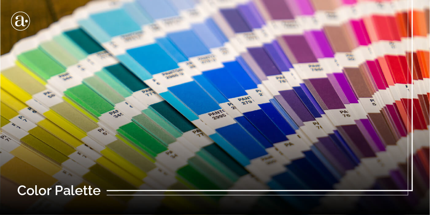
Your customers don’t only buy your products or services, they also buy into the meaning and associations behind it. So when developing and marketing a brand, we try to use color more strategically to convey the meaning, emotions and experiences in a way that stands out from others and speaks to the target group. Your brand’s color scheme is a key part of its visual language. How can you use color more strategically? In this article, you will learn how to choose the right brand color scheme and the 9 major colors that are used in branding. You will also be provided with 10 tips on how to use color more effectively in branding. With this info, you will be able to develop a more effective color palette for websites, advertisements and other forms of communication in both online and print.
How To Choose The Right Color Scheme for A Brand
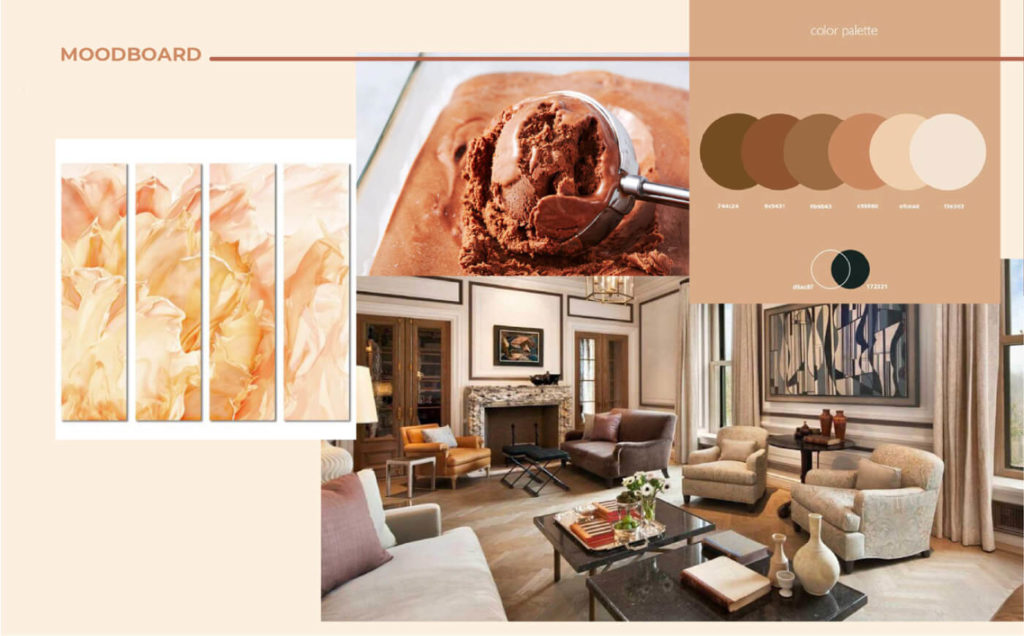
1.) Use A Moodboard
Creating a moodboard is one of the best ways to develop an effective color scheme for your brand. You can browse search engines or stock photography sites by searching for terms that are related to your brand and what you are looking to convey through your messaging. This way you can find the right imagery that conveys the right tones, emotions, personality and message. You can get inspired by interior design or pictures from different cultures and art movements. You can create a moodboard using Milanote or pinterest. You can also print various images and place them on a board to see how they look in print.
2.) Get Inspired By Nature
We live in a very colorful world. By studying natural scenes you can find colors that go very well together. You can get inspired by the seasons and how they convey different emotions. You can also check underwater or look in the sky.

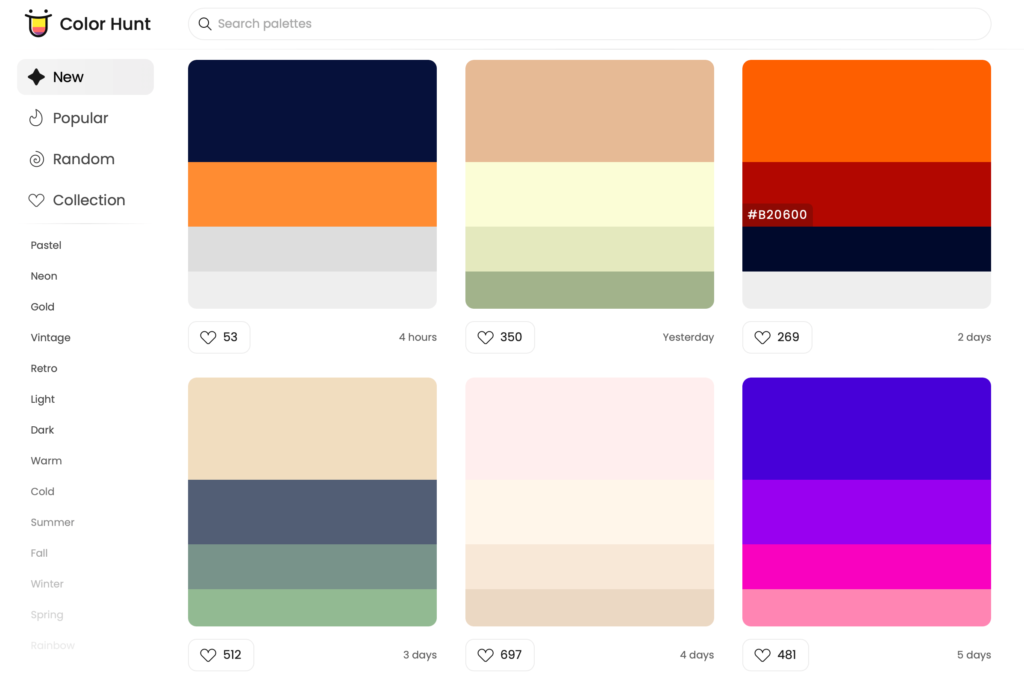
3.) Use Color Hunt
Color Hunt is a platform where you can search and find different color schemes for creative projects. Through this platform you can find the various brand color options to choose from. You can also create collections and search based on different themes and styles such as pastel, vintage or retro.
4.) Understand the Relationships
There are 6 main color relationships on the color wheel. Each of them have different effects on the eye. By understanding the different relationships, you can decide on the right color combination to achieve the desired effect.
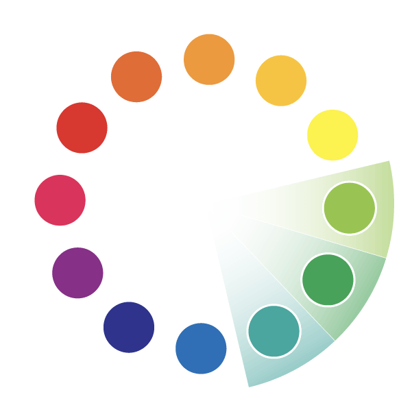
Analogous

Complementary

Monochromatic

Double Complementary

Triadic
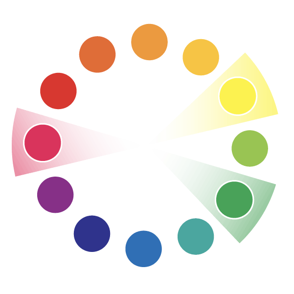
Split Complementary
The 9 Major Colors That Are Used in Branding
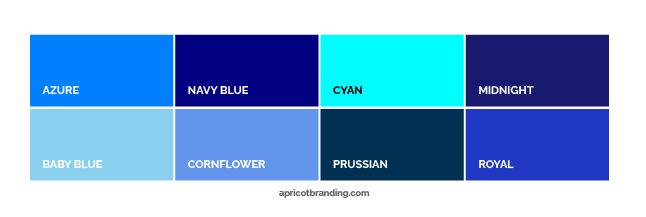
BLUE
Loyalty, Competence, Intelligence, Trust, Peacefulness, Calm
Blue is the color of trust. It can be easily paired with green, yellow or purple. If paired with red then it will be associated with US patriotism. If paired with orange then it should be done very carefully or the colors will clash. light blues like baby blue can make your brand look very young and calm. Bright blues can make your brand look very professional. While deep or dark blues are more mature and professional as well.
The problem with blue is that it is used too often as a brand color. Blue can also make your brand feel too cold if it isn’t used carefully.
Associated with: Water, Cleanliness, Sky, The Democratic Party
Brands that use blue effectively: Facebook, Paypal, Gilette, Digital Ocean, Dreamworks, Dallas Cowboys, Blue Apron, Bed Bath & Beyond, Barkbox, General Motors, Charles Schwab, Coinbase, Barclays, Linkedin
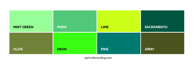
GREEN
Nature, organic, growth, wealth, vitality, success, health
Green is the color of growth. Green can convey the idea of sustainability or care for the planet. It can also convey the idea of prosperity. That is why it is used a lot in the financial sector along with blue which is associated with trust. Bright greens like lime and neon are great for drawing attention. Green can easily be paired with blue, yellow, orange or red. If you pair green with red then your brand will be associated with Christmas and festivities. When green is mixed with blue it forms a beautiful turquoise or teal that is appealing to women and rarely used by brands.
Associated with: Plants, poison, money, sustainability
Brands that use green effectively: Starbucks, John Deere, Whole Foods, Shopify, Zipcar, Cash App, Clover, Hulu, BP
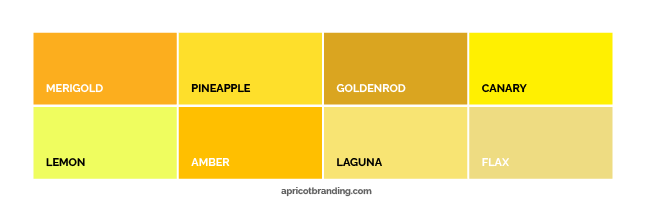
YELLOW
Optimism, friendly, happiness, cheerful, radiant, young, playful, warm, sweetness
Yellow is a warm color known for its bright sense of optimism. Yellow is the color of happiness. It makes your brand look younger and more cheerful. It can make your brand seem playful and childish as well. Yellow could actually make people feel hungry, especially when paired with orange. Yellow can be easily paired with blue, green, orange, red, purple, brown or black. When paired with white, it should be done carefully because of the low contrast.
Yellow might make text hard to read. When using yellow with text, it should always be used with a background color that gives it good contrast. Avoid using yellow for body copy.
Associated with: Sunshine, Gold, Sunflowers
Brands that use yellow effectively: Sprint, McDonalds, Western Union, Caterpillar, Chevrolet, Nikon
ORANGE
Creativity, expression, uniqueness, confidence, exciting, delicious
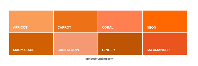
Orange is a very warm and eye catching color. When you reduce the saturation it becomes more like brown. Orange is best when it is paired with other warm colors like yellow and red. When paired with red it is associated with fire. When paired with green it is associated with citrus and health. When paired with black it is associated with halloween. Orange is eye-catching when used at night. That is why it is used on road signs. It can also be great for vehicle wraps because of the way it grabs attention at night.
Associated with: Citrus, autumn, Fire, Halloween (When used with black), Safety, Roadsigns
Brands that use orange effectively: Hubspot, Neil Patel, Hooters, Popeyes, Bobcat, Nickelodeon, Alibaba, The Home Depot
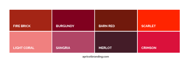
RED
Bold, dynamic, daring, exciting, passion, energy, loving, romantic, angry
Red is the boldest and most attention-grabbing color. When paired with blue, red can convey a sense of patriotism in the US. Deep reds like burgundy or merlot can convey a sense of luxury. Bright red is best used as an accent color for drawing attention. It can also create a sense of urgency, depending on how it is used.
Avoid using red with body copy because it can be hard on the eyes. Red can also make your brand seem very loud if it is not used carefully.
Associated with: Lipstick, Blood, Discounts, Emergency, Danger, The Republican Party, Fire, valentines day
Brands that use red effectively: (RED), Netflix, Target, Virgin, Budweiser, Coca-Cola, Chick-fil-A, Supreme, Burlington, Airbnb, Pinterest
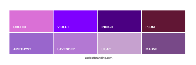
PURPLE
Royalty, spirituality, imagination, wise, sophisticated, surprising
Deep purples can convey a sense of luxury and sophistication. Purple can also convey a sense of spirituality, especially when paired with black. When mixed with red, it forms a bright magenta. Purple works well when paired with blues, reds and yellows. Sometimes it can also be used with orange as you see with FedEX. Deep tones like Plum can also work we’ll with brown. If purple is paired with green then it should be done carefully.
Associated with: Magic, Gospel, Purple Iris
Brands that use purple effectively: Cadbury, Hallmark, Yahoo, Stripe, Claire’s, Legalshield, Roku, Lyft
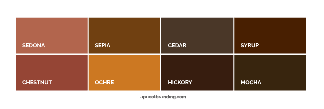
BROWN
Rustic, rugged outdoors, comfort, stability, solid, durable
Brown can be very rustic and outdoorsy. At the same time, tones like Sedona and Chestnut can be more creamy, comforting and luxurious if you pick the right ones. Brown is seen a lot in interior design and luxury brands choose it because of the sense of quality that it has. Brown is a more mature color that is used to speak to an adult audience. Brown works very well with warm tones like yellows, oranges and reds. Light browns like beige and champagne can give your brand a classic feel.
Associated with: Wood, chocolate, sweetness
Brands that use brown effectively: Burberry, Louis Vuitton, Ferrero Rocher, Hershey, Nespresso
BLACK
luxurious, elegance, authority, mysterious, powerful
Black is the combination of all colors(in print). It is used to convey a sense of power and luxurious elegance. It can also create a sense of mystery and can be easily paired with any other color. Black is best used as a background color or for text on a light background. Avoid using pitch-black on a white background for body copy because too much contrast may be hard on the eyes.
Associated with: Night, space
Brands that use black effectively: BBC, Uber, Sony, The North Face, L’Oreal Groupe, Jack Daniel’s, Jeep, Nordstrom, The Ritz-Carlton

GREY
Balanced, secure, reliable, intelligent, calm, modern.
Grey is used to convey a sense of intelligence, calm and balance. Apple uses grey most effectively from their logo to their product design to convey a sense of sophisticated minimalism. When grey is used in a gradient, it forms a clean metallic silver. Grey is best paired with white or black to convey a sense of sophistication. Grey is rarely used by major brands. Even Grey Goose does not use grey! Grey may not draw attention but it is definitely unique.
Be careful when you mix grey with other colors because it will reduce the saturation and can make your brand colors look muddy.
Associated with: Smoke, Metal, Minimalism
Brands that use grey effectively: Apple

How To Use Color in Branding
1.) Avoid picking colors based on subjective reasons
Do you choose your brand colors just because you like them? or was there a more solid reasoning behind your design choice? How color is used in branding is quite different from how it is used in visual arts. In branding, we use color more strategically. We consider the industry, the target audience and how the color translates in both online and print. We also consider the message, emotion and personality of the brand that we are trying to convey through color. We assign roles to different colors and maintain consistency across all touchpoints. We don’t just choose colors based on what we like or don’t like. A lot of thought and care goes into color in branding.
2.) Understand the difference between online and print usage.
How color is used online/onscreen is quite different from print. A color palette for websites will need to adapt to print ads and other forms of media. Colors that are used on screen are called RGB colors while colors that are used in print are called CMYK colors. You could also use standard Pantone colors to maintain more consistency.
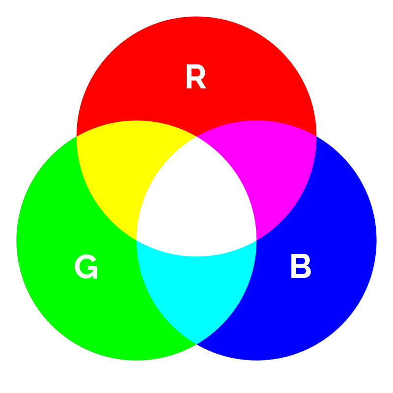
RGB Colors: RGB stands for Red, Green and Blue. RGB colors are used on-screen and rendered by light instead of pigments. RGB works by rendering red, green and blue at different levels of intensity to create a broader range of other colors than CMYK. RGB is also much brighter because it does not rely on printer ink.
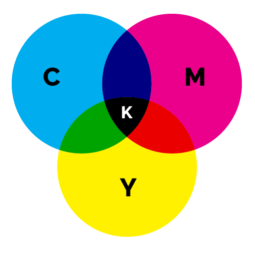
CMYK Colors: CMYK stands for Cyan, Magenta, Yellow and Key(which refers to black). They are also known as Process colors and are used exclusively for print. By combining these 4 colors of ink at different variations and tints, the printer is able to create the illusion of the other colors we see.
Some printers are able to produce a broader range of colors but CMYK has certain limitations. Colors like purple, turquoise and neon tend to look very different in print so it is important to consider the difference if your brand uses these colors. You will be shocked when that bright purple that you chose comes out looking a little bit dull after it is printed.
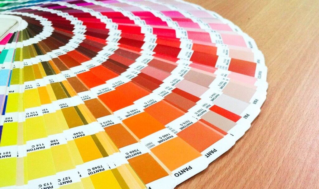
Pantone Colors: Are part of a standardized Pantone Matching System(PMS) that allow you to maintain more accuracy in both print and online. These colors come in handy when you are using 1 to 3 solid colors and you need to be as consistent as possible. They are also sometimes referred to as spot colors and come in a broad range of variations.
3.) Avoid too many colors
Does your brand have so many different colors all over the place? Avoid a color palette that looks too busy. Ideally, you can aim for 3-6colors max. You can even aim for different tones of 1 color. Ideally you should have a primary and secondary color as well as an accent color to draw attention to the most important elements in a design or advertisement. There should also be background colors that are chosen.. Everything helps to hold the scheme together. Ideally you should have 1 color that comes to mind when people mention your brand. By owning a color in people’s minds, your brand can become more memorable. Similar to how we associate green with Starbucks, yellow with McDonalds and red with Target.
4.) Keep your color scheme consistent
One way to maintain a consistent color scheme is by using a style guide. A style guide is a document that has all the details on your brand’s visual direction including how you approach color. To learn more about style guides you can click here. It will have all your different color codes listed. It should also have directions on how to use them for anyone who is creating marketing or promotional pieces for your brand. That way if you have anyone creating a website or advertisement, they can use it as a reference to know which colors to use and how to use them. If you can’t afford a style guide then a brand sheet is a more simplified version that you can use. It isn’t as detailed as a style guide but it is better than nothing. By using a style guide or brand sheet, you can keep your brand colors consistent in both print and online.
5.) Be clear about your brand personality
With the right color scheme, you can express your brand’s personality in a more meaningful and attractive way. What is your brand’s personality? How can you express it more effectively through color? If your brand is very calm and soothing then you would not want to use colors that are too bold, energetic or exciting. If you are trying to look more trustworthy then you may want to avoid too much saturation. Studies show that people find websites with less saturated colors to be more trustworthy.
6.) Always consider how your color scheme works with imagery
Consider how your brand’s color scheme works together with imagery to convey the personality, emotions, and experiences behind your brand. For example, if your brand uses soft colors then the images should also be soft and soothing. If your brand uses bright colors then the images should also be bright and energetic. When you combine color with imagery effectively, you are able to convey a stronger sense of emotion. Your brand color scheme should always be compared to its imagery. Avoid using images that clash with your brand colors. Your brand images should either match the brand colors or complement them.
7.) Always consider how your color scheme works with text
How does your brand’s color scheme works with text? Does your color scheme make the text hard to read? To you it may seem easy to read but other people are actually struggling. Most people will not work too hard. If your white text on light-grey background is hard to read then they will just ignore what you have to say. There should always be good contrast between the color of the text and the background. Avoid white text on yellow backgrounds. Avoid too much contrast as well. Pitch-black text on white backgrounds may be hard on the eyes.
8.) Avoid using the same colors that everyone else uses
Also, it is important to consider other brands that show up next to you on google. Are you using the same colors that everyone else is using? Studies show that blue is actually the most overused color so you might want to consider other options. Just using a different tone of the same color can make a huge difference.
If you truly want your brand color to stand out as unique then avoid the traditional colors that we tend to see brands use all the time like blue for boys and pink for girls. Aim for tones that are rarely used. Colors that are a unique combination like reddish-purples, yellowish-pink, off-white or bluish-greens are rarely used. You will notice that there are a lot of other colors that people don’t use or even know the name of. Color tones like champagne, sangria & sedona are rarely used but can help your brand stand out as more premium.
9.) Understand your niche and target audience
Consider your niche and target audience. Are they usually older or younger? Men or women? That would help you determine the right tones. Are you a luxury brand or are you more affordable or family oriented? This would also help you determine the right tones. For websites, consider accessibility, especially if your brand is targeting an older audience. By having good contrast on your website, you can make it more accessible to users with visual impairments.
10.) Avoid making false assumptions
When picking colors, it is important to avoid cliches and false assumptions. A lot of people believe that all women love pink. but the truth is that recent studies revealed that women don’t love pink as much as we may assume. Pink is actually more fit for young girls. But older women like more mature-feminine tones. Turquoise is actually more appealing to women. Ask Tiffany & Co!
In Conclusion
Your brands color scheme is an important part of it’s visual language. A lot of care goes into your brands development and we try to maintain consistency across all touchpoints to help your brand stand out as cohesive, authentic and professional.
How can you approach color more effectively? If you enjoyed this post then you may also enjoy my previous article on brand imagery with 5 examples from leading brands. Here I explore imagery and how leading brands are using imagery to convey their message more effectively. By learning from leading brands, you can apply similar practices to your brand as well.