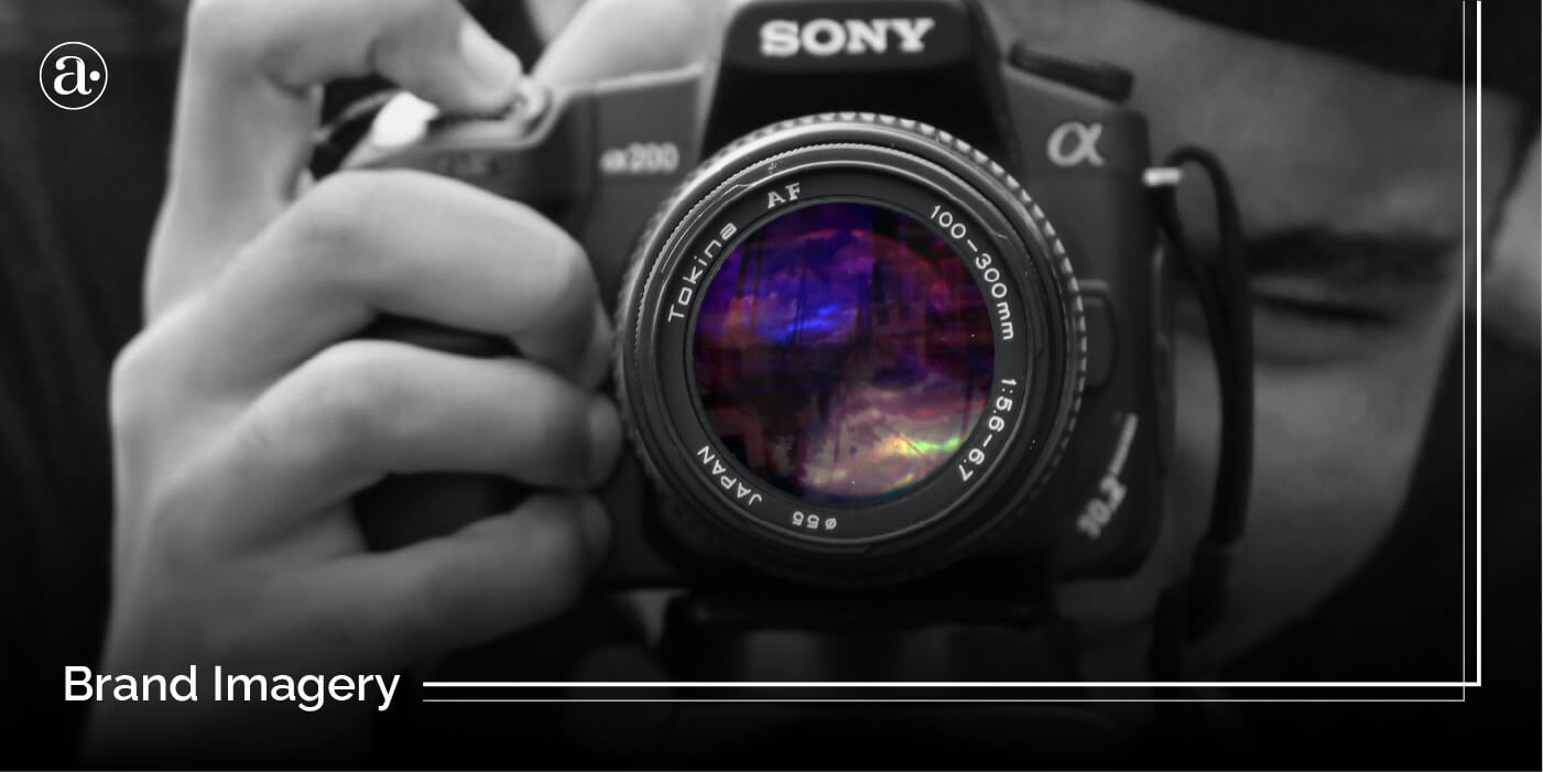
Your brand imagery is a key part of it’s visual language that should not be left out. Consumers rely on images more than text because they are more eye catching as well as easier to digest and remember. Imagery is used in websites, content development and advertising to convey a more distinct look and feel. How can you use your brand photography to stand out more and tell your story in a more compelling way?
Brand Imagery vs Brand Image
People often confuse brand imagery with brand image so I need to first clarify the difference. Your brand imagery refers to the images that are used to convey your brand message with a consistent look and feel. Your brand imagery includes it’s photographic approach and how you approach visual content. It also influences your overall brand image. On the other hand, your brand image, is the external perception of your brand which influences what people say about it. It is a reflection of the trust and other associations that people have with it. Below are 5 examples of brand imagery from leading brands.
1.) Dell
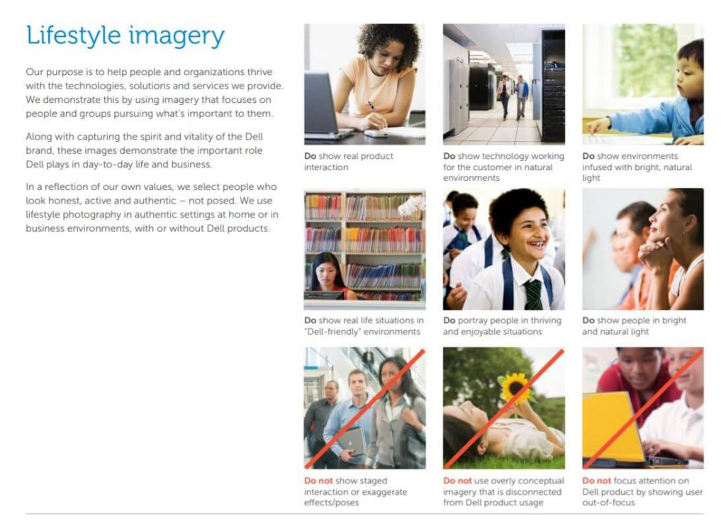
Dell is about delivering technology solutions that enable people to grow and thrive. Their brand guidelines show a very detailed and extensive photographic approach. Dell uses photography to convey the brand personality and establish a more meaningful emotional connection with customers. Each image they select makes a statement about who they are as a company and the experiences they provide.
The people in their brand photography always look honest, diverse, active and authentic. Their lifestyle images are never posed. They show people in authentic down-to-earth settings, pursuing what is important to them. This allows viewers to see themselves in the subject of the photo.
Dell doesn’t focus attention on their products if the user is out of focus. They never use overly conceptual images that are not connected to their product usage. You never find cliché images in their advertising. They also never use digitally manipulated images or images that look staged, unrealistic or artificial. These are all best practices that help the brand stand out as more authentic.
2.) Charity Water
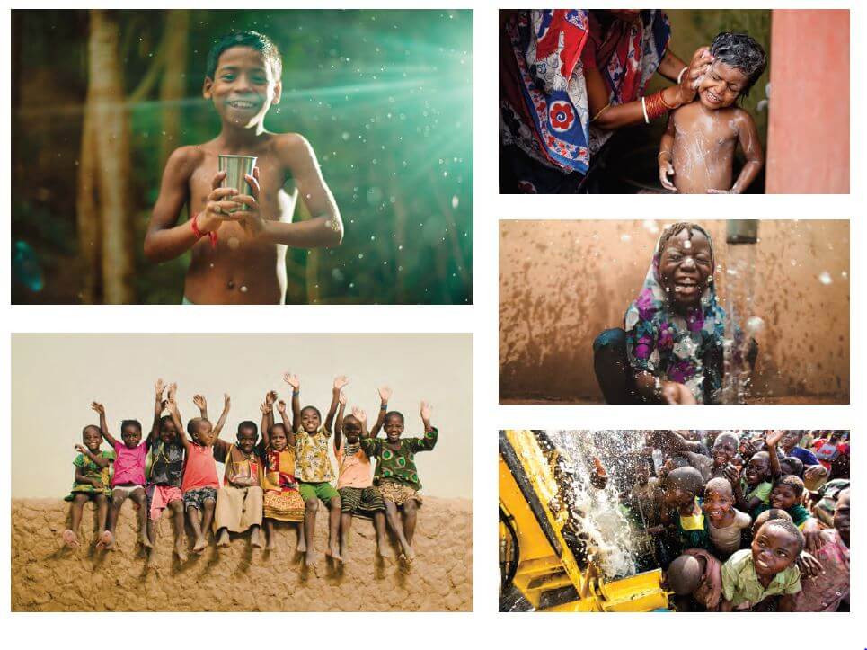
Charity Water is a non-profit dedicated to bringing clean, safe drinking water to people in developing countries. A key differentiator is that 100% of public donations go to water projects. They understand the importance of building a strong visual language to set them apart and amplify their message in both online and print. A key part of their visual language is their imagery.
Photography is an essential part of the Charity Water brand. Charity Water uses photography in their visual content development to communicate the idea of opportunity and possibility. Through their photographic approach, they try to avoid making people feel guilty or sad about the worlds problems. Their brand imagery always conveys a sense of hope and optimism through smiling people, no matter the situation. The goal is for everyone who interacts with the brand to feel inspired, hopeful and motivated. This would help drive people to take action.
3.) Cisco
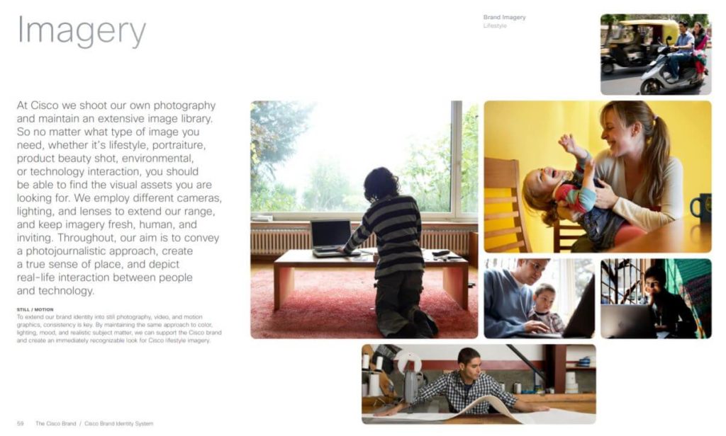
Cisco provides businesses with innovative software-defined networking, cloud, and security solutions. A key component of Cisco’s visual language and content development is their approach to imagery. Although Cisco is a tech company with very complex offerings, Their brand photography is still fresh, human and inviting. This also prevents the brand from looking intimidating or too complex.
Cisco avoids artificial lighting in their photography. They try to make the most use of natural light and convey a sense of openness. Their photos are never staged. Their environmental photographs may have a strong focal point to give a sense of context and point of view. They always show real people in real situations and environments. As well as real-life interactions between humans and technology. This helps their brand stand out with a more authentic photographic approach.
4.) American Express
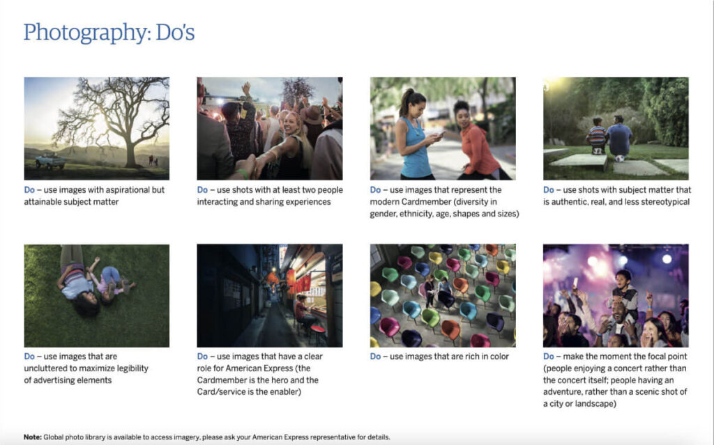
American Express is a multinational financial services firm. In the financial sector, trust is the number 1 factor that determines how they communicate as a corporation. This also determines how they approach imagery as part of their overall visual language.
They avoid using images that have artificial filters. They also avoid depicting stereotypes and images that look ostentatious. Their images always look original and are never staged or posed. They avoid background images that look too busy in order to ensure legibility in all their advertisements. They try to emphasize the moment and show memorable interactions between people. Their brand imagery shows diversity in race, gender, etc. Their images can also be aspirational and rich in color.
5.) Big Commerce
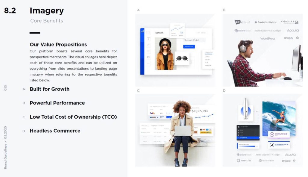
In the world of ecommerce, brands are also integrating imagery into their visual language. One example is Big Commerce which is an open Software As A Service (SAAS) platform leading a new era of ecommerce. Big Commerce is about exploring limitless possibilities to build, innovate and grow. Their style guide which was published in 2020 outlined the updates that were made to their design direction. One key component was their approach to imagery/photography.
Big commerce uses a human-centric approach to photography and visual content development. They share moments of collaboration and interaction as well as environmental images of their office spaces. The people of Big Commerce are a key differentiator so they often show portraits of their merchants and partners who use the platform.
Their imagery often merges photography with interface design through visualizations of their value propositions or key differentiators. This allows them to take complex concepts and present them in a more interesting way. Some examples of value propositions that they express through imagery are the concept of being built for growth as well as the powerful performance, Low Total Cost of Ownership(TCO) and Headless Commerce. These are all complex concepts but when presented through imagery they become more visually engaging.

In conclusion, Your brand imagery is an essential part of what makes up your style guide or visual direction. It determines how you approach visual content development, and advertising. It is what allows your customers to relate to your brand. Through imagery, you can convey the brand experience as well as other complex ideas in a more engaging way. Visual content also allows you to tell a more authentic and engaging story. If you enjoyed this article then you may also enjoy my previous one on How leading brands are using illustration to connect with people.
Don't Forget to Share or Subscribe!
Get Your Free Download! Delivered to Your Inbox.
5 Branding Mistakes to Avoid
Learn about the 5 Branding mistakes that business owners can avoid.