A rebrand refers to the strategic change in a company or organizations corporate image. It could range from a name change to a new approach to messaging or identity. It could also include a new logomark. There are many reasons why companies go through a rebrand. They may need to look fresh and modern. They may be going through a corporate transition, introducing new products or market insights may reveal opportunities for a rebrand. Their current brand may also not properly represent what the company is about. It may look inconsistent or cluttered. They may also be looking for ways to enhance their brand recognition and build brand loyalty.
The role of brand recognition
Companies sometimes fail to consider the importance of brand recognition. Before a rebrand, you must understand the perceptions that people have about your current image. How will the rebrand affect your current brand recognition and perception? But first, I need to clarify that a rebrand is not just about getting a new logomark. It is a more complex part of a company or organizations lifecycle that is driven by strategic objectives and insights. A rebrand can vary in scope and budget. It could include the renaming of a brand, or a new visual identity, tagline or campaign. But rebrands do not always turn out very well. Below are 5 examples of rebranding failures from well known companies that we can all learn from.
1.) British Petroleum (BP)
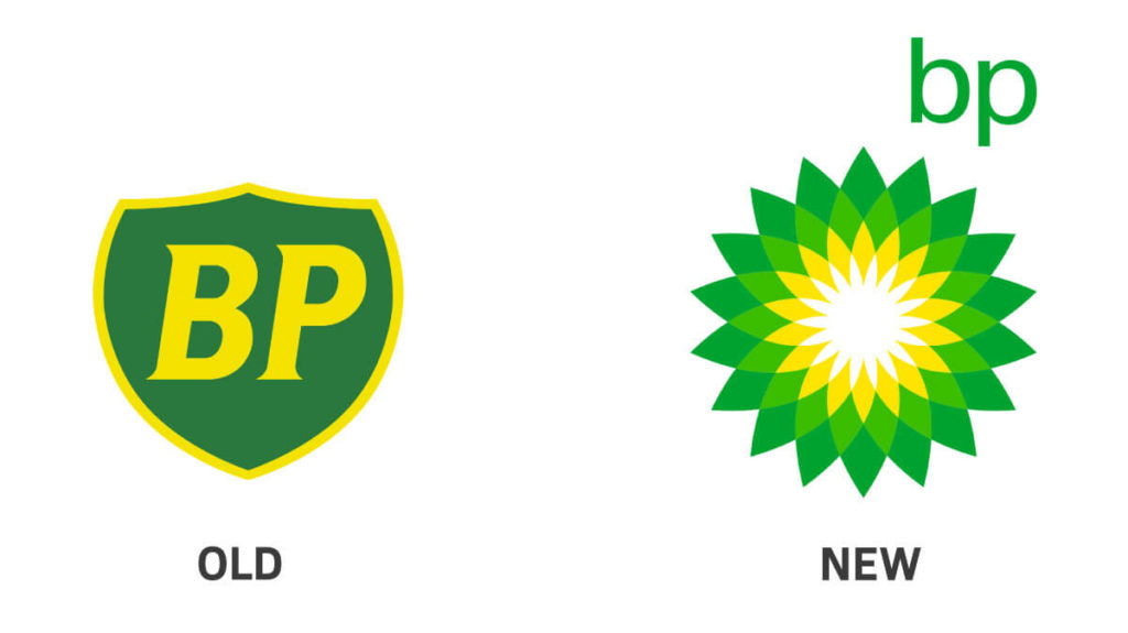
In 2000, British Petroleum(BP) unveiled their new visual identity that replaced their shield with a new logomark that featured a geometric flower motif. The rebrand also resulted in the new slogan of “Beyond Petroleum”. The rebrand was executed by Landor Associates. This was a huge rebrand that was an investment worth millions of dollars. It was supposed to portray the brand as more eco friendly or environmental to create a sense of trust and brand loyalty.
But in reality, the truth is that a fossil fuel company that claims to be environmental is a complete hoax. Their logomark also did not honestly reflect what the brand was about. 10 years later, the Deepwater Horizon Crisis lead to a huge public backlash against BP. This was arguably the largest oil spill in the history of the Petroleum industry and it devastated the environment. It lead to millions of dollars in penalties and charges against the brand. It also lead to widespread critiques of their brand and logomark which became a symbol of environmental disaster.
Lesson Learned: You can’t put perfume on a pig. Don’t try to make your brand look like what it is not.
2.) Tropicana
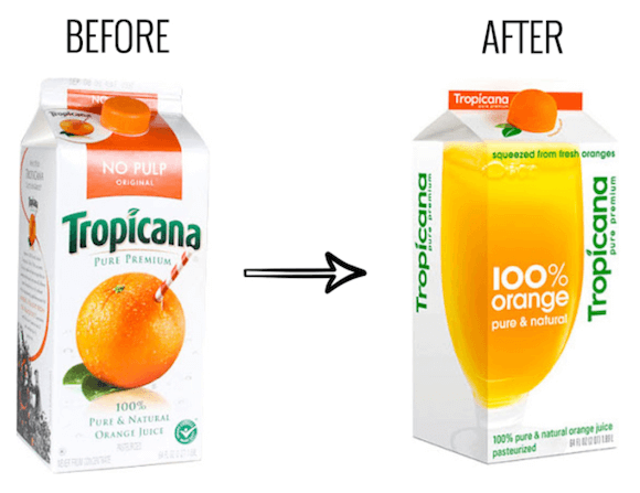
Tropicana, in 2008, hired ad agency, Arnell, to execute a rebrand that would hopefully make it look more modern and refreshed. This rebrand cost millions of dollars and led to a complete redo of their packaging design along with an advertising campaign with the slogan ‘Squeeze, its natural’.
The packaging was completely changed, from the logo to the slogan, typography and imagery. The new packaging replaced the logo with a more modern look that was flipped vertically. The lid was replaced with an orange shaped lid that was supposed to be more ergonomic and mimic the experience of squeezing an orange when the bottle is opened. The most devastating change was the glass of orange juice which replaced the orange with a straw.
Unfortunately the rebrand sparked a lot of negative backlash and criticism from customers who already had a strong sense of brand loyalty to the old packaging. The new packaging caused their brand recognition to decline as people began to see the product as a cheap knockoff that they could not recognize. This eventually led sales to decline by 20% and they had to get rid of the new packaging and go back to the old one.
Lesson Learned: If you already have brand loyalty, Don’t completely change to the point that you lose brand recognition.
3.) GAP
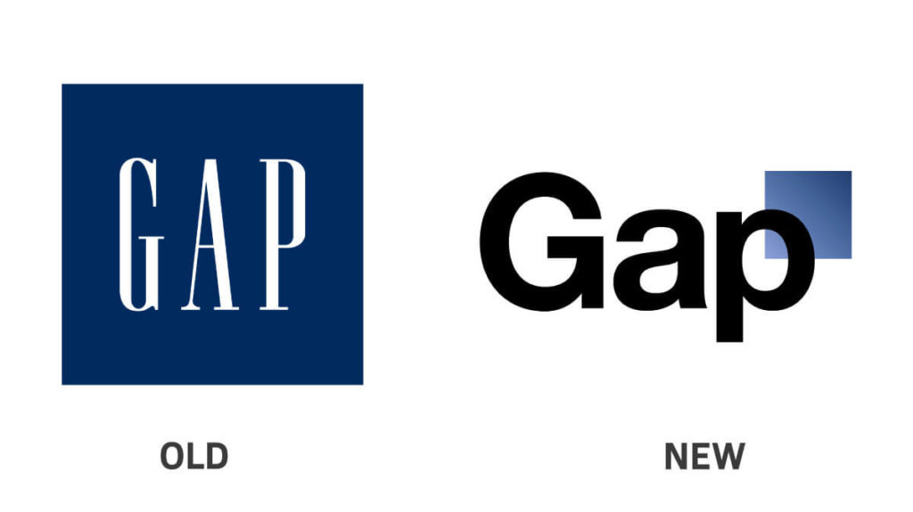
In late 2010, Gap unveiled their new visual identity as part of their rebranding effort to attract more media attention, buzz and free publicity. Their new visual identity replaced the iconic condensed serif typeface with Helvetica. It also removed the blue box background and placed a smaller blue box next to the P instead.
If there was a brand strategy behind this change then it was definitely done poorly. It was done with no pre-launch campaign or attempt to collect proper feedback from the public. This rebrand got them the free publicity they were looking for but unfortunately it was negative publicity. There was a huge social media backlash with thousands of negative comments. People already had an emotional connection with their classic logotype which already had a strong sense of brand recognition. It was replaced with something that was more generic, cheap, and tacky.
Lesson Learned: Don’t try to fix what is not broken
4.) Sears
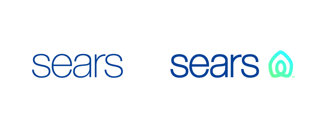
In 2019, Sears, the retail giant, unveiled a new brand identity as part of it’s rebranding effort. The new logomark includes a new abstract symbol to represent home and heart. The rebrand also included a new tagline of “Making Moments Matter”.
The problem with this new visual identity is that it looked too much like Air BnB. The tagline of “Making Moments Matter” also did not really resonate with people because it wasn’t a statement that people associate with Sears. It seemed more like a marketing cliché. The symbol was also unnecessary and looked more like it belonged to a tech company.
Lesson Learned: Avoid familiar looking symbols and cliché sounding taglines.
5.) General Motors
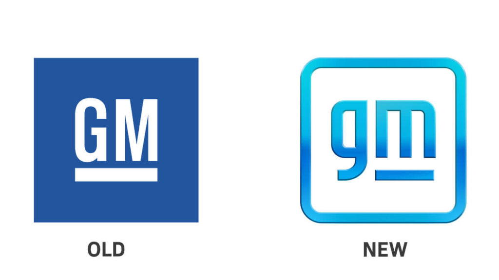
Earlier in 2021, General Motors revealed it’s new lettermark logo as part of a rebranding effort to reflect it’s future commitment to electric vehicles. The rebranding effort included a new visual identity along with an advertising campaign by McCann World Group with ‘Everybody In’ as the slogan.
The new visual identity is intended to be more modern with rounded edges and a lighter blue gradient to represent the clean skies of a more sustainable future with zero emissions. The lettermark logo goes from uppercase to lowercase and places the dash under the ‘M’ instead of both letters. There is also intended to be an electric node shape incorporated into the negative space to reflect the commitment to electric vehicles.
The problem with this rebrand is that it replaces the old identity which already had strong brand recognition with associations like trust, safety and innovation. This new logo looks more like the app icon for a tech startup instead of a company that is over 100 years old with a strong legacy. It faced wide criticism on social media.
Lessons learned: Sometimes looking older may be a good idea if your brand has a lot of heritage associated with it. Everyone doesn’t have to look more modern.
In conclusion, A rebrand is not only about changing the logomark. It needs to reflect the meaning that the brand has in peoples minds, hearts and lives. A company’s image shouldn’t be changed to the point that it loses brand recognition. If people already have an emotional bond with the brands visual identity then it does not have to change entirely. A rebrand should help the brand stand out and be driven by a strategy. If a brand has years of heritage then changing it’s identity can cause it to lose brand loyalty. If you enjoyed this article then you would also enjoy my previous one 5 Reasons Why Your Company Needs A Rebrand