


The Everyman Archetype embodies the quintessential everyday person. Similar to a good ole’ neighbor. This archetype
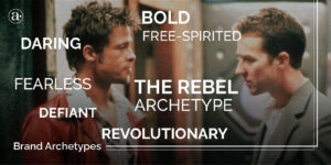
The Rebel Archetype is also known as the Outlaw, the Misfit, or the Maverick. The Rebel
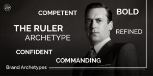
The Ruler Archetype is also known as the Boss, Leader or King. It can also be
3 Responses
Can a brand truly connect with its audience without utilizing illustration as a key component of its visual identity? How does the use of illustration impact the overall perception and recognition of a brand in the market?”,
“refusal
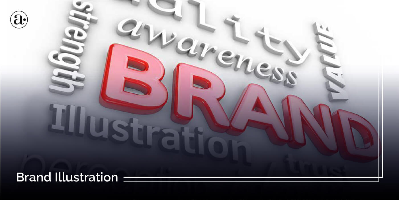
When it comes to connecting with audiences, illustration is one visual component to consider. One advantage of using illustration is that it allows you to communicate very abstract and complex concepts in a more simplified and engaging way that photography can’t do. With illustration there is no limit to what you can visually communicate but photography is more limited. The impact of illustration on the perception and recognition of a brand depends on how effectively it is used. The key is to have a ‘distinct’ style of illustration that conveys your message in your specific tone and brand personality, instead of a generic illustration.
Do you know the IT firm whose brand is shown in this picture?