Read To Lead is a non-profit fundraising campaign focused on promoting literacy and disrupting the school-to-prison pipeline in Maryland.
The Challenge
Studies show that third graders who are not proficient in reading are statistically slated for prison. Less than 40% of Maryland Highschoolers are graduating from college career ready. Maryland also has the highest incarceration rate of African-American males between 18-24 in the US. The Read To Lead program empowers children to learn while strengthening their families to thrive.
In order to launch the fundraising campaign effectively, Read to Lead needed a more effective design approach. The project included a new visual identity and a tagline that best communicates the mission, as well as ongoing advertising for both online and print with a consistent design approach to aid retention and drive awareness.
Target Audience: Potential Donors, Coaches, Parents with struggling children
The Solution
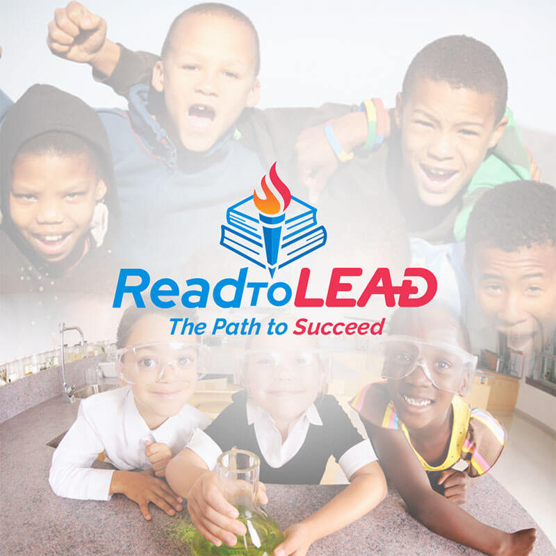
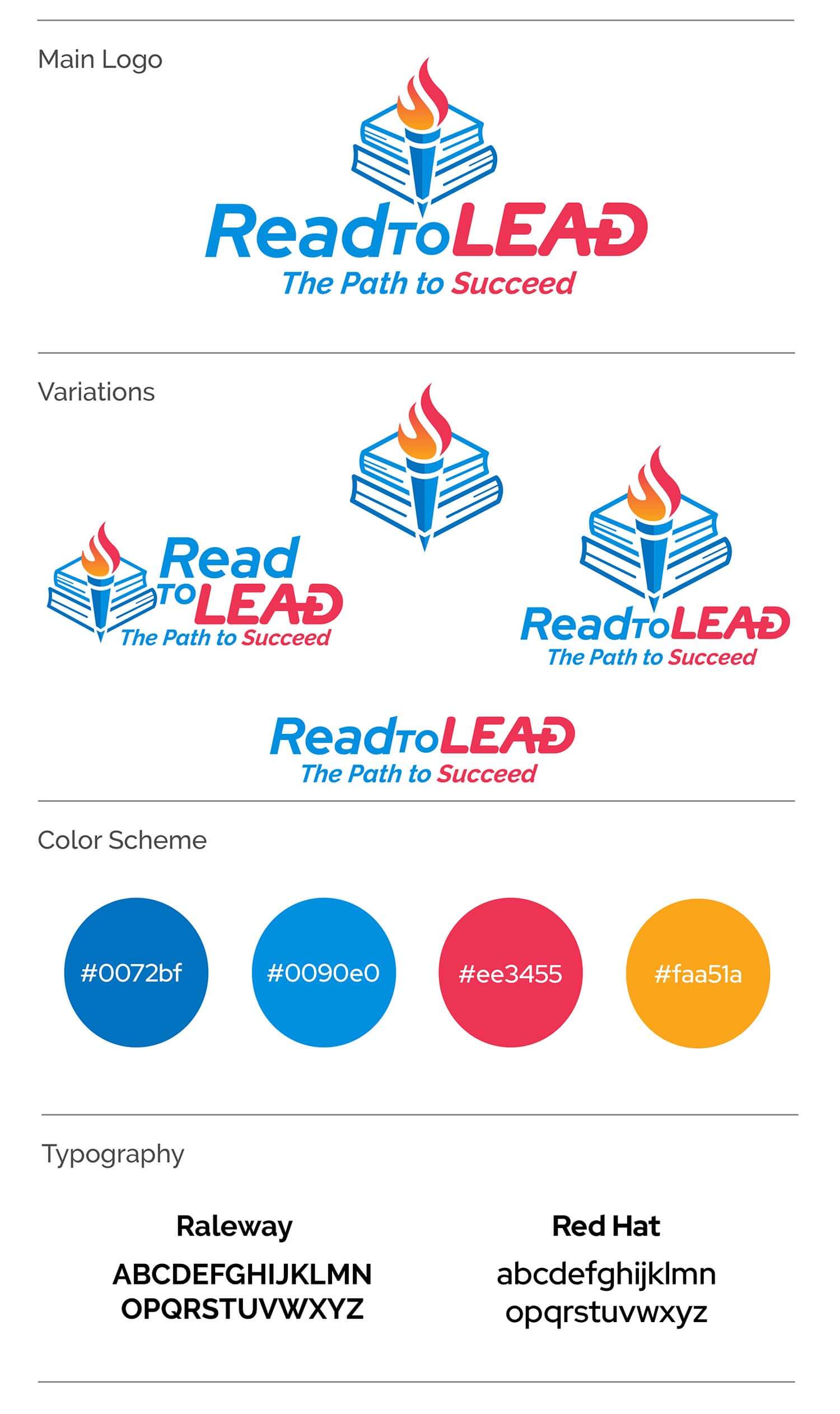
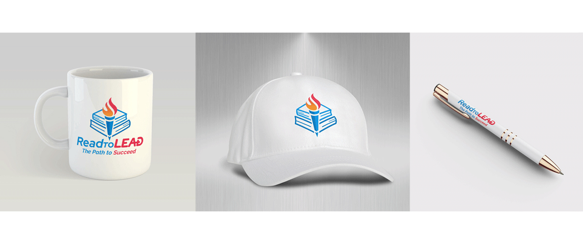
We decided on a solution that would work for both 3rd graders and older students without looking too childish. It also translated nicely on promotional products by working well in 1 color print. The color scheme is youthful and lively to convey that ‘Learning is Fun’. The letter A+ is added to the word ‘Lead’ as a mnemonic device as well.
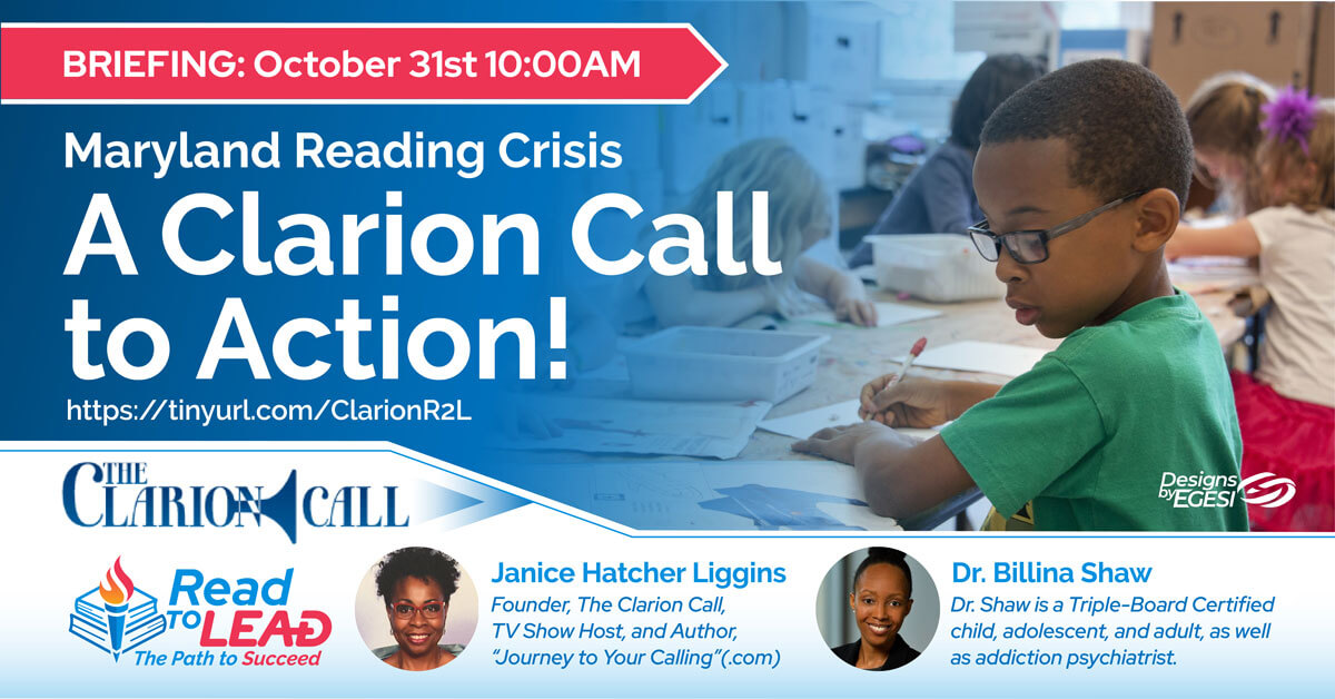
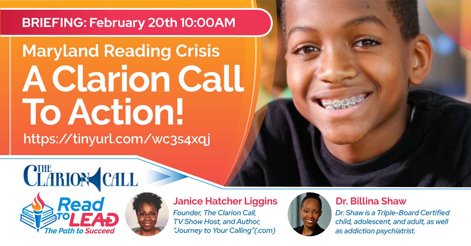
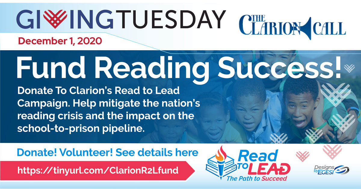
The Read To Lead Program is a branch of the Clarion Call which is a larger Non-profit. The Clarion is symbolically associated with the middle ages so the torch was used for Read To Lead logo in order to keep the theme consistent. The torch matches the Clarion Call as a medieval symbol and the torch is also associated with empowering, shedding light or leading the way. It reflects the brightness and intelligence or the inner potential of the youth. The tagline of “The Path to Succeed” also helps to convey the message of what the program is about. A series of other campaign advertisements were also created as part of the social media campaign.
The Read To Lead visual identity allows for a more consistent and effective design approach to the fundraising campaign. The torch represents youth empowerment, shedding light or leading the way. It reflects the brightness, intelligence and inner potential of the youth.
You too can also help make a difference. Your support could make the difference between a path toward prison or a path toward college for underserved youth. If you would like to contribute to supporting youth literacy by becoming a donor or a sponsor then visit The Clarion Call by clicking here.
Would you like to work together?
If you would like to discuss a new visual direction for your non-profit, click below and let’s get in touch. It all starts with a free consultation.