User-Friendly web design is about allowing your website users to be able to achieve their goals and perform tasks with efficiency and satisfaction within a specified context of use. You need to make your website more user-friendly if you want customers to spend more time on it, revisit it in the future and even share it with others. In this article, I would go over tips to improve your site as well as website tester programs that help you spot issues that could negatively impact the user experience.
All elements of the site should work together to create a cohesive experience. It must not only be aesthetically pleasing but guide the user and allow for intuitive and seamless navigation. It must be designed with a sense of empathy, understanding the users goals, needs, mental models, pain-points and motivations.
There are many ways to make a site more user friendly but below I have outlined 5 of them that you can apply today to improve your online experience:
1.) Keep It Simple
Remove clutter and maintain clarity across all pages. Avoid superfluous elements that over-complicate a webdesign and make it too busy and distracting. Users should easily recognize where they are and what they can do as well as why they should do it. Avoid having too much color everywhere. Use color more strategically to highlight important elements and guide the users eye path through the flow of an experience.
2.) Avoid Information Overload
Limit the amount of information that users must scan to find relevant info. You can also use chunking to semantically divide large bodies of content into different sections with headers so users can easily read through. Avoid industry jargon as well and try to use more simple language.
On average, users are only able to maintain around 5-7 chunks of info at a time in their short term memory. Too much info will be easily forgotten so be sure to reduce the short term memory load of your users and try to present the info in an engaging way using imagery, graphics and color.
3.) Increase Page Speed
You need a website that is able to load quickly and doesn’t leave the user waiting. Most users expect a page to load in less than 2 seconds. If your website is taking too long to load then they can just leave! Your page speed also affects how it ranks on Google. Your page speed can be negatively affected when you have too many plugins running, if you have a slow WordPress theme or if you have large files on your website. Remember to optimize imagery before upload.
One way to optimize your images is by running them through smartpng.com
You can also check your page speed using Google Pagespeed Insights or tools.pingdom.com. It is a free website tester designed to help you optimize your load time. It will give you a breakdown of your websites performance as well as suggestions.

4.) Maintain Consistency
Use consistent colors, hierarchy, typography, layout and interactive elements in every page of the site. This aids recognition and helps to create a more intuitive experience, not only on your website but through various media and channels.
Consider using a style guide to keep your branding consistent. A styleguide will determine how you approach color, typography, photography, layout, etc. Larger brands also use design systems to maintain alignment through various touchpoints and platforms online. This would help users recognize your brand online and become accustomed to it. Remember that consistency is key.

5.) Prioritize Accessibility
Consider how users with disabilities and impairments will be able to interact with the site. The population of elderly users are also on the rise and their vision begins deteriorating after 42 years old. They also experience hearing and cognitive decline at certain ages. Therefore your online experience needs to be optimized to be more user-friendly for them. There are many ways to approach this but below I have listed a few tips.
- If you are developing your site using WordPress then consider using themes with already built-in accessibility. This way you can improve the experience more easily even though you may not know how to develop accessible code.
- Group content semantically and ensure your website has a clear and organized structure and hierarchy.
- Make sure images have descriptive alt tags. Imagine if you were describing your images to a user with visual impairments. That is how descriptive your alt tags are supposed to be. Allow the user to visualize in his/her mind what is being displayed on the screen. Also, make sure your brands videos have closed captions.
- Consider mobile accessibility and make clickable elements large enough and further apart.
One way to check your site for accessibility is by using WAVE, the free web-accessibility evaluation tool. This free website tester can help you discover new ways to make your site more accessible. However, the best way is to test the website with a real user with disabilities because these free online tools and ADA compliance might not always be enough.
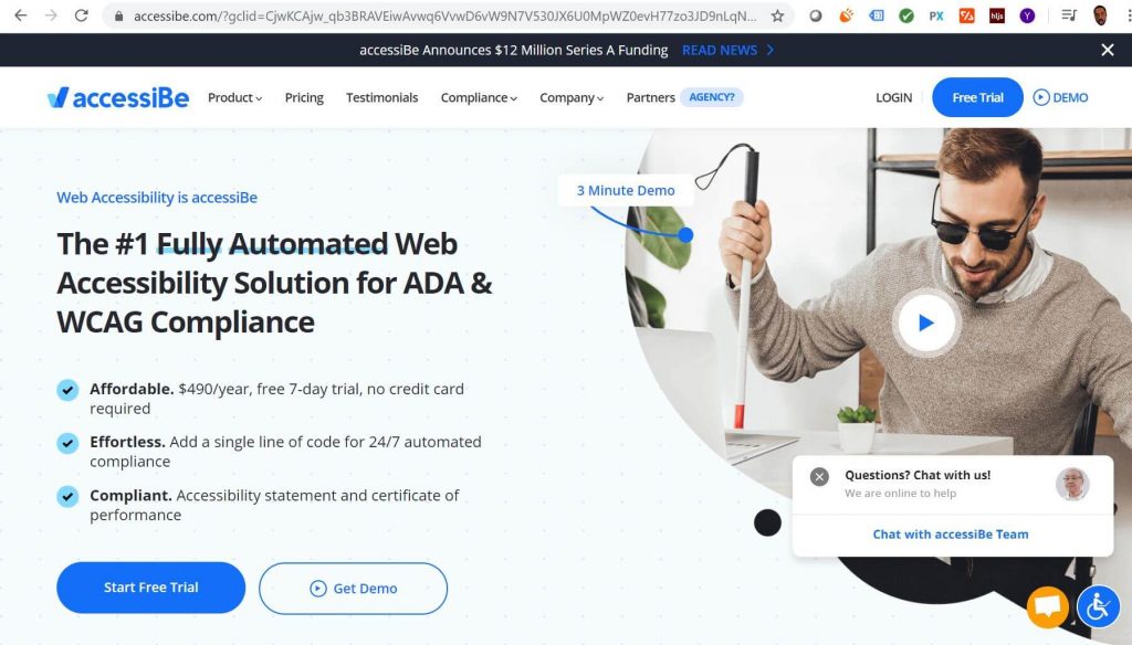
If it is feasible, you can also use Accessibe, the #1 fully automated web accessibility solution for ADA & WCAG compliance.

In conclusion, if your website is not performing as well as it should then one of the tips listed above could improve it. You can also use a website tester to help you better optimize it. User-friendly web design is also about ensuring that your users get the experience they deserve with your brand that is as-good-as or even better than your competitors. Especially if you are looking to reach a broader audience online. You need to implement best practices. If you have any questions or feel that your website may not be user-friendly or easy to use then feel free to reach out. You can also follow this link to leave a message and we can discuss ways to improve your site.


