Illustration is increasingly becoming an essential part of any brand style guide or design system. Illustration examples can be found in almost any industry because brands are beginning to look for a more unified and distinct style of illustration to tell their story and make better connections with people. Even in the tech space, brands are beginning to see the value.
Illustrations allow for a more fluid visual expression that brings a sense of life and personality to the brand experience. They are a better way to break down complex concepts, values and offerings for people to understand. Illustration also allows for more abstract and metaphorical storytelling. Below I have outlined some of the best illustration examples in branding as well as links to where you can learn more.
Illustration Examples in Branding
1.) AirBnB
AirBnB is an online marketplace focused on vacation rentals. They offer unforgettable trips and travel experiences to places around the world. Their design language uses illustration to not only communicate the experience but to emphasize the diversity and the inclusive nature of the brand.

The illustration style is fairly minimal as well as down-to-earth, friendly and approachable. The key insight that inspired the illustration style for AirBnB was that people of color did not feel represented. Therefore, the illustration style needed to reflect the brands commitment to inclusivity and connecting people across cultures. It shows the diversity of age, race, gender, disabilities, etc. AirBnB is #1 of all the illustration examples when it comes to diversity.
To learn more about AirBnB’s illustration style, you can follow this link to the project case study by Jennifer Hom.

2.) Thumbtack
Thumbtack is an online service that matches customers with local professionals offering a variety of services. Their new illustration style more clearly reflects the company value of collaboration and teamwork. It is also more versatile and able to scale across the platform at various sizes. It was inspired by the idea of creating a world or ecosystem where the visual elements work together cohesively.

The core theme that inspires the illustrative approach of Thumbtack is “Larger Than Life”. It is about building things that are greater than oneself, balancing different tasks and overcoming obstacles. It uses a color palette that is separate from the core brand palette but softer, more approachable and pastel. The system was developed by Krystal Lauk in collaboration with the brand marketing team at Thumbtack. To learn more about this project, you can follow this link to the case study.
3.) Shopify
Shopify is a Canadian multinational ecommerce platform. Polaris is the name of the design system that they use to communicate across different channels in their distinct look and feel. It is a set of guidelines and principles for building Shopify’s apps and channels. Their design system is made up of different parts, from iconography to color palette, typography and datavisualizations. But a key component of their design system is their illustrative approach which is used to communicate directly with merchants on a more human level.

They rarely use illustration for decoration. Instead, they use illustration more strategically for on-boarding, announcements, progress indicators and empty states(when a page goes wrong). Their illustration style is very clean and minimal. It is also very focused on delivering a single message in a simplified way. To learn more about the illustrative approach of Shopify, follow this link to visit the Polaris web page.

4.) Slack
Slack is a proprietary business communication platform in the enterprise tech space. It offers a new way for teams to collaborate and communicate. It’s faster, more organized and secure than regular email. Their illustrative approach can be described as warm and friendly but polished and sophisticated. It is inspired by the works of Charley Harper and Mary Blair.

What separates Slack from the other illustration examples is the distinct use of bold colors with warm tones, along with organic shapes and diverse characters with expressive poses. The poses playfully depict the idea of collaboration to complete tasks. This is rarely seen in the enterprise tech space and allows the brand to further differentiate itself. To learn more about this project, you can follow this link to the website of Alice Lee, the illustrator.

5.) Upwork
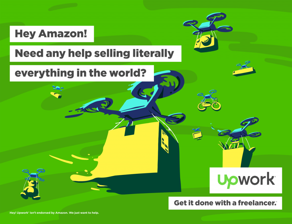
Another illustration example can be seen in advertising campaigns. Upwork is a freelance platform where enterprises, agencies, freelancers and professionals connect. They recently released the “Hey World” campaign that playfully offers freelance services to busy cultural icons, businessmen and enterprises. Below is an ad in which they reach out to Elon Musk.
The campaign conveys the idea that Upwork freelancers are ready to get the job done, no matter how large. Here is an ad that offers freelance services to Amazon as well. The ads all have a distinct illustrative approach that ties everything together. The campaign was developed by the creative agency, Duncan Channon. To learn more about the campaign you can follow this link,.

6.) Atlassian
Atlassian is an Australian software company(SAAS) that offers products for software developers and project mangers. Their illustrative approach reflects the idea of celebrating diversity. They believe that the best teams are diverse and inclusive, therefore the design language needed to reflect that. They wanted everyone to feel represented in the tech industry. Their style of illustration depicts people of different ethnic backgrounds working together to complete tasks.

This project can be considered to be part of a larger movement to make the tech industry look and feel more inclusive. The visual language was developed by the brand designers and illustrators at Atlassian. To learn more about the project you can follow this link to the Medium article.

7.) Digital Ocean
Digital Ocean is a cloud infrastructure provider (IAAS). They provide developers with cloud services that help them to more efficiently build, test, manage, scale and deploy apps on multiple devices. Their illustrative approach is designed to work cohesively to convey a more seamless, simple, but powerful cloud experience.

The brands illustration took very complex concepts and used design to convey them in an abstract way that helps to draw the eye. The design direction incorporates lots of isometric illustrations as well as a more abstract and futuristic look and feel. The rich and vivid deep blues help to tie the system together. To see more of this project, you can follow this link to view it on Dribbble.

In conclusion, These illustration examples in branding show that there is a growing movement to incorporate illustration as a core component of a brands visual identity. Illustration brings the brand to life and allows for a more emotional expression that connects with people at a human level. Especially in the tech space, brands are beginning to see the value of using a distinct style of illustration to convey complex concepts in a simple or abstract way.
Illustration allows for more flexible visual expression using metaphors, visual cues and abstractions. There is also a movement to convey more diversity and inclusion so brands are looking for illustration that better reflects the variety of cultures around us. If you find this article helpful then you may also enjoy my previous one on how to use storytelling to build engagement.
If you would like to learn more about the importance of illustration in branding, as well as how leading brands successfully implement illustration systems, then you would enjoy the following link: “Brand Illustration 101: Visualizing the Narrative”.


3 Responses
Can a brand truly connect with its audience without utilizing illustration as a key component of its visual identity? How does the use of illustration impact the overall perception and recognition of a brand in the market?”,
“refusal
When it comes to connecting with audiences, illustration is one visual component to consider. One advantage of using illustration is that it allows you to communicate very abstract and complex concepts in a more simplified and engaging way that photography can’t do. With illustration there is no limit to what you can visually communicate but photography is more limited. The impact of illustration on the perception and recognition of a brand depends on how effectively it is used. The key is to have a ‘distinct’ style of illustration that conveys your message in your specific tone and brand personality, instead of a generic illustration.
Do you know the IT firm whose brand is shown in this picture?