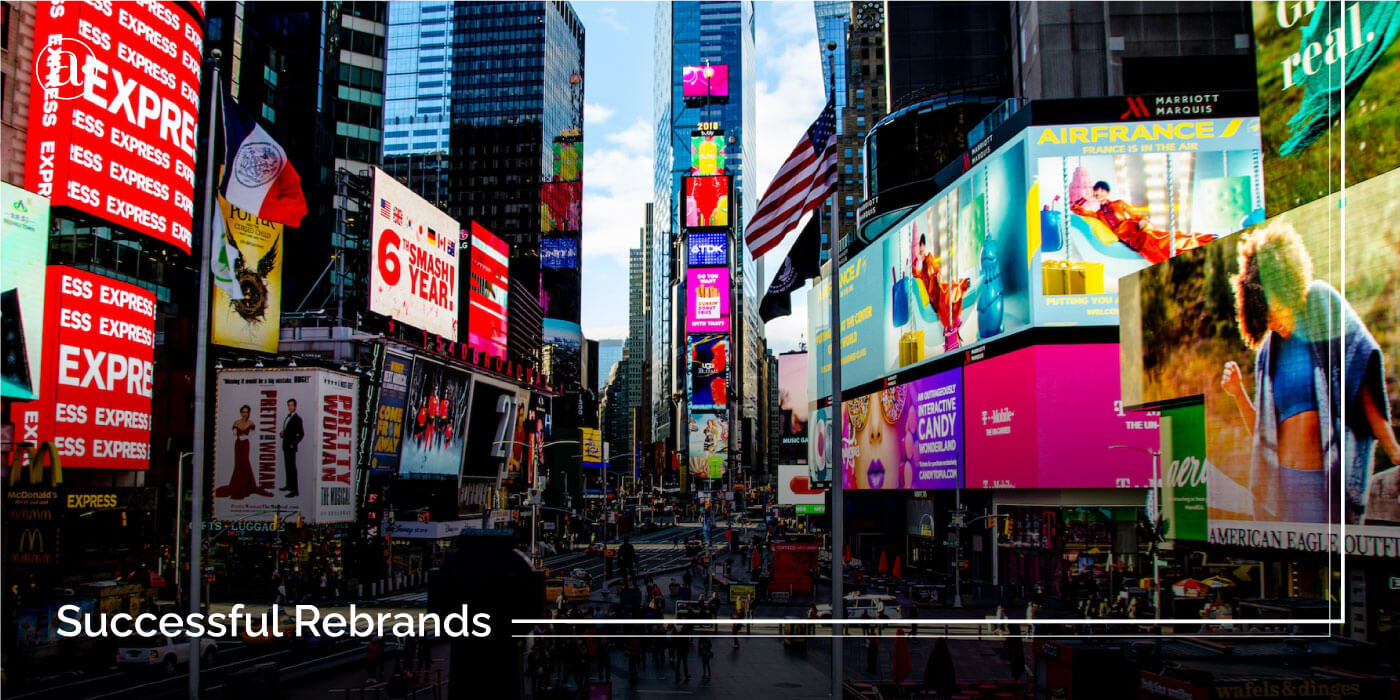
There comes a time in the lifecycle of any company or organization in which it needs to go through a successful rebrand in order to evolve. A lot of people think that getting a rebrand is just about getting a new logo or changing your colors but this is a huge misconception and it is the reason why a lot of rebrands fail. Getting a rebrand is more about taking some time to rethink your brand, your industry and where things are heading. It is how your brand is able to evolve and adapt to changes while seizing opportunities. It is about transformation. It is about exploring new markets. It is about re-envisioning your industry and the role that your brand plays in the hearts and lives of consumers.
A well-executed rebrand can completely transform not only your company but your entire industry as a whole. In this article, we will explore 5 of the most successful rebrands from the past along with some lessons that you can learn from them. But first we need to understand what makes a rebrand successful.
What Makes A Rebrand Successful?
- A Clear Objective: In order for a rebrand to be successful it needs to have a clearly defined objective. What is the goal of the rebrand? What are you hoping to accomplish as a company or organization? What key challenges are you looking to solve? It needs to align with your business objectives and solve business challenges. Avoid just getting a rebrand for fun or else it will fail.
- In-Depth Research & Strategy: Secondly, a successful rebrand needs to have a well-developed and executed strategy. It has to involve enough research to gain a much deeper understanding of how the world is changing and how your industry is changing. Most importantly, all successful rebrands are done through a much deeper understanding of consumer perceptions and behaviors to understand how they perceive the current brand. Through research into the market, you can avoid traps and identify opportunities. There has to be a new positioning and direction where the brand is heading. Feel free to click here to learn more about brand positioning.
- A New Visual Direction or Messaging: Thirdly, a rebrand needs to lead to a new visual direction, messaging strategy or narrative to reflect the change and how the company is evolving. This is usually what people associate with rebrands but a successful rebrand does not always have to include changing the logo or colors. It can also be a new vision or mission, a new campaign or even a new retail environment to reflect the change.
- Meaningful Impact: A rebrand also needs to have a successful outcome that can be measured. What happened as a result of the rebrand? It shouldn’t just be that your friends liked the logo. There has to be a meaningful impact. Did it improve performance within your company and align your stakeholders? Did it create buzz and build anticipation on the internet? Did it lead to an increase in marketshare and consumer preference for your offers? All these things need to be measured in order to clarify the impact of your rebrand.
5 Examples of Successful Rebrands to Learn From
1.) CVS Health
Around 2016, CVS partnered with Siegel + Gale to develop and execute a rebranding initiative. Research showed that they were widely perceived to be just a convenience store and they wanted to be perceived as a more innovative pharmacy that is shaping the future of healthcare from an enterprise level.
CVS Caremark Corp. needed to reinvent itself as CVS Health to reflect the new direction and core purpose of helping people on the path to better health. CVS was also becoming the first pharmacy to remove tobacco from its stores and this was a bold move that further reflected the new direction that the company was taking.
CVS worked with Siegel + Gale to develop strategies that align with the new purpose and vision. This also included brand architecture refinement and the development of a new brand narrative of Leading with heart which served as a core theme that would run through all communications. This rebranding initiative led to the simple but memorable new tagline that Health is everything, along with a new visual language that reflects the new direction that the brand is taking.
The new visual identity combines pre-existing brand elements with new elements that reflect the new strategic vision. The new iconic CVS Heart is bold, universally understood, dynamic, and flexible in application. It reflects the brand’s new purpose and helps to position the brand as a leader in a rapidly-changing industry. A set of icons and a library of illustrations were also developed to further enhance the brand’s visual expression.
The Result
As a result, the new brand strategy helped to drive future business initiatives such as the acquisition of Aetna and Target’s pharmacy. The rebrand helped to strengthen the brand image and attract a lot of positive press and media attention. After the rebrand, they also saw a 22% increase in pharmacy sales revenue.
Lessons to Learn: All successful rebrands for well-established businesses must begin with research to understand the current perception of the organization. Rebrands must always be aligned with business initiatives. Also, by being the first to do something, you can position your brand as a leader.
2.) Hootsuite
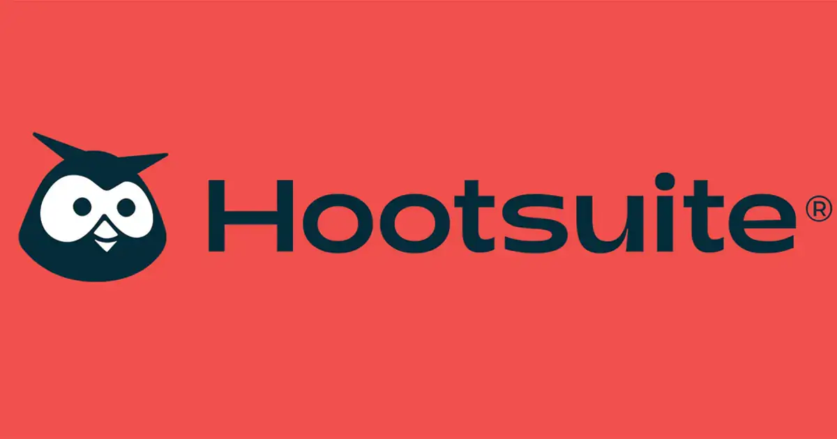
In the world of SAAS, Hootsuite is the first social media management platform with over a billion users around the globe but over time the niche has expanded and become overcrowded with competition. As the leading provider of social media management, Hootsuite needed to rebrand to reassert its leadership position while expanding into new capabilities and offerings so they decided to partner with Prophet Consulting on a rebranding initiative.
After a thorough research and analysis, they were able to identify new opportunities for Hootsuite to differentiate its messaging and clarify its positioning. A new purpose for the company was developed that revolves around leveraging the power of social to uplift and ignite both brands and businesses. new value propositions were also developed to communicate their new capabilities and offerings. A new slogan of Your Guide to the Wild was also developed. It communicates how social media can be overwhelming but Hootsuite is your guide through the digital jungle. The fresh new visual direction and verbal identity helped the brand to further stand out in all communications. The new brand character “Owly” was also developed to give the brand a more dynamic identity that is friendlier and more playful.
The Result
As a result, the rebrand helped to align and revive the internal team and stakeholders. It attracted a lot of publicity that resulted in over 94 million impressions and 1.7 million prospects within 60 days of the brand relaunch.
Lessons to Learn: A rebrand is also a cross-functional initiative. It should help to revive internal teams and stakeholders, while creating buzz among external audiences. The rebrand should also amplify the personality traits that consumers will value the most. Hootsuite was able to amplify the playful and friendly personality traits in order to make social media feel less overwhelming and improve their perception as a friendly and helpful guide to social media management.
3.) Uber
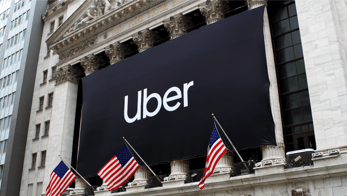
Uber was launched in 2009 as just a Silicon Valley ridesharing company but over the years it needed to evolve into a platform for global mobility with a more global outlook. They were also looking to expand into other forms of transportation like food delivery with Uber Eats. Their current brand did not allow them to scale globally. A lot of people did not understand what their old symbol was and it was often ridiculed on the internet. Their toxic corporate culture also contributed to painting a negative image of the brand and they were losing market share to Lyft and other similar competitors.
Uber actually first tried rebranding in 2016 with an in-house team and a more localized visual direction to target diverse cultures in different geographies. After the CEO resigned and was replaced, Uber partnered with Wolff Olins on another rebranding initiative to address the challenges that the brand faced while reflecting the change in leadership that was taking place within the company.

A new strategy was developed that transitioned Uber from a ridesharing app to a global mobility platform with a focus on people. A new mission statement was developed that We ignite opportunity by setting the world in motion. This new statement is bolder, clearer and easier to remember.
A more holistic brand system was developed to allow them to communicate at a global scale to diverse markets without being overly complex. The new direction is simple but universal and flexible but consistent. They replaced their old ambiguous symbol with a more recognizable wordmark. Another successful aspect of their rebrand was the app redesign in which the entire user experience was revamped with a more seamless navigation.
The Result
As a result of this initiative, Uber was well-positioned to expand their geographic footprint and make a greater impact around the globe. Since their 2018 rebrand, Uber’s brand value went up by 51% and they eventually went IPO in 2019 at $82 billion USD.
Lessons to Learn: A rebrand should always be done with a long-term perspective to allow you to easily expand into new regions, categories, and niches in the future. Also, by embracing simplicity, a brand can more easily communicate across global markets.
4.) AirBnB
AirBnB is an online marketplace for people to discover, list, and book temporary accommodations around the world. It was founded in 2008 but since then the founders believed that the brand had a lot of potential that wasn’t being tapped into. They wanted AirBnB to mean more than just an alternative to a hotel or motel. It needed to be about more than just a place to stay. It was time to evolve their brand.
Research revealed that what customers loved the most about AirBnB was the sense of global community and belonging that they felt. This was a key differentiator so the rebrand needed to reflect this. The rebrand included a new positioning, visual direction, website revamp and digital experience. At the core of their new brand was the idea of Belong Anywhere and it was now all about “people” rather than just places. This new narrative focuses on people and the sense of belonging that is shared.
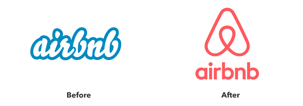
The visual direction was developed by DesignStudio, a london based branding and design agency. They got rid of the cold blue tones and replaced it with a warmer and brighter color scheme. The visual direction combines AirBnB with the concepts of people, love, and places and introduced the Bélo symbol that we know and recognize today. It incorporates an abstract location marker with a person, a heart, and the letter “A” for AirBnB.
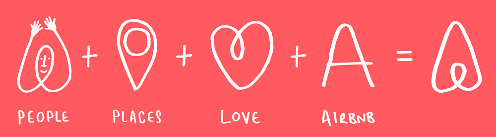
One key to the success of their new visual identity was the amount of semiotic research that was conducted to find out how the logo will be perceived across diverse cultures around the globe. Brian Chesky, the founder of AirBnB, hopes that in the future, the logo can be recognized as a universal symbol for sharing. The logo is dynamic, flexible and memorable. They also allow customers to personalize the logo to fit their own personal taste. DesignStudio also partnered with AirBnB to further develop their digital experiences to resonate with diverse cultures across the globe.
The Result
As a result, the new strategy helped to further differentiate the brand and AirBnB achieved global recognition. It propelled their company valuation to $29 billion above their competitors in less than 4 years. The new visual identity also went viral on social media and won several awards.
Lessons to Learn: A rebrand should always enhance the attributes and themes that customers already love the most and associate with your brand. Also, If your brand is expanding globally then there needs to be enough research to understand how it will be perceived across diverse cultures.
5.) Starbucks
Last but not least, we have to recognize how the Starbucks brand has evolved over the years. Starbucks was originally founded in 1971 in Seattle as a small retailer selling premium coffee beans, equipment, and spices. At that time, it was simply a local shop with a steady base of regular customers.
The turning point came when Howard Schultz, a coffee enthusiast with his own company called Il Giornale, saw greater potential for the brand. Inspired by Italian coffee culture, Schultz envisioned rebranding Starbucks from a specialty retailer into café-style experience focused on community, ambiance, and premium coffee. This vision would eventually evolve Starbucks into a global brand that helped transform the coffee industry. Schultz acquired the company in 1987 and merged it with his own company and set the stage for a bold new strategic direction for the company.
One interesting thing about the Starbucks rebrand was that many people initially didn’t believe it would work. At the time, few thought Americans would line up to pay $3 or more for a cup of coffee each morning. But Howard Schultz had a strong understanding of both business strategy and branding. He recognized that Starbucks could become a part of people’s daily routine—not just for coffee, but for the experience.
This rebrand shifted the focus to the customer experience—from the store environment and the sense of community that people associate with Starbucks today.
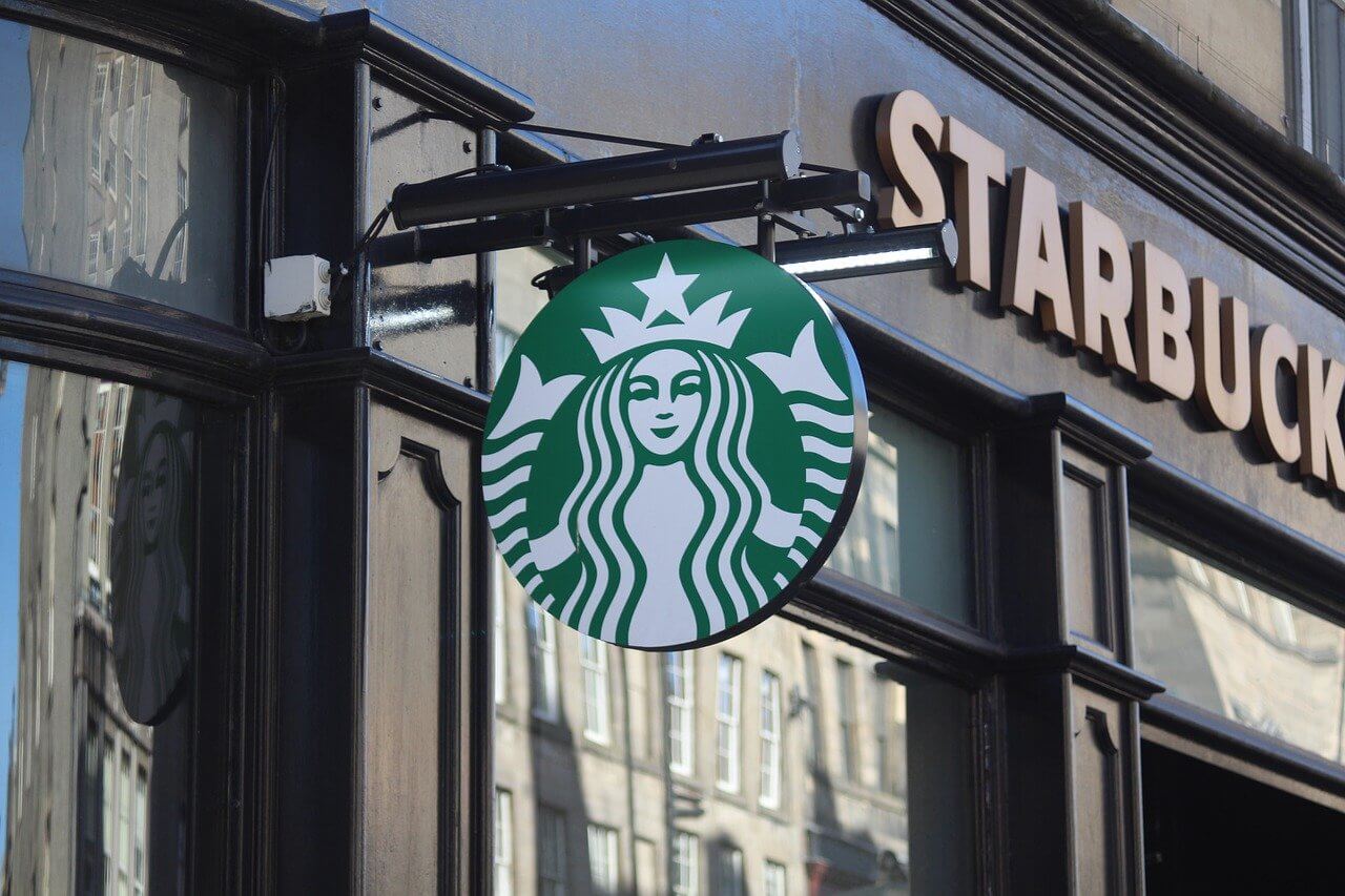
This is the period in which the Starbucks logo that you recognize began to take shape. The original logo, featuring a brown and vintage-looking siren, was designed around 1971 by a graphic designer named Terry Heckler. But after the acquisition and rebrand in 1987, the logo began to evolve to reflect the company’s new direction. Unnecessary visual details were removed, and the design was modernized while still preserving brand recognition. The iconic Starbucks green—brighter and more inviting—replaced the original brown palette. The logo continued to evolve in 1992 and again in 2011 into the logo that is widely loved and recognized today.
In 2009. Starbucks also launched its MyStarbucks App with a more seamless and personalized experience. This innovation further boosted customer engagement and brand loyalty.
The Result
This rebrand, and continued evolution, shaped Starbucks into the global brand that we know today. After the initial rebrand, Starbucks had secured investor backing and was positioned for rapid international expansion.
Lessons to Learn: Sometimes you might need to go with your gut and trust your vision. Howard still kept pushing through, even when others doubted him. Secondly, a rebrand should always preserve the attributes and equity that customers already recognize. Although, Starbucks completely rebranded, they still preserved the name and brand character that people already recognized and they built their brand off the equity and local relevance that was already established instead of starting from scratch.
Thirdly, we need to recognize it is not just about the product or offer, it is more about the emotional experience. Howard understood this and was able to successfully create a “third-place” between home and work, where customers could enjoy both coffee and community.
Final thoughts..
In conclusion, A rebrand is not just about changing the logo and colors, it is more about transformation and evolution. It is driven by a combination of strategic objectives and creative ideas but it takes boldness to be willing to explore new possibilities for your brand.
One example is CVS which rebranded from a regular convenience store to a more innovative pharmacy that is shaping the future of healthcare from an enterprise level. Hootsuite also rebranded to strengthen its positioning as the leading social media management platform. Uber rebranded from a ridesharing company to a platform for global mobility and AirBnB rebranded from just a hotel alternative to a global community where people belong anywhere. Lastly, Starbucks rebranded from a local coffee retailer into a third-place environment that brings the community together. This decision helped to transform it into a global brand that is transforming the coffee industry.
These brands have successfully made a meaningful impact in the world and your brand can do so as well. It all starts by being open to change. Because as the world changes, your brand should evolve as well.
If you found this article informative then you may also be interested in a previous one on 5 rebranding mistakes to learn from. Please don’t forget to share or leave a comment to let us know your thoughts.