Mom's Beauty Secrets
Mom’s Beauty Secrets is a skincare brand that specializes in all natural soaps and body butters that are gentle to the body and kind to the earth.
The Challenge
After taking a moment to do an audit on the website, we found that the old website was too slow and this had a negative impact on rankings and performance. There was also no detailed report on how it was performing in the search. In order for the brand to evolve, it needed to move from Weebly to a more robust e-commerce platform. We needed to improve the overall design, messaging, and shopping experience, and make it more trustworthy. The product images needed to be spiced up and the descriptions were too short. There was no clear privacy policy or shipping and returns policy. The old site did not really address customers or the questions and concerns that they may have.
Target Audience: Gen X women primarily who are looking for a natural alternative to commercial soaps for a healthier lifestyle.
The Solution
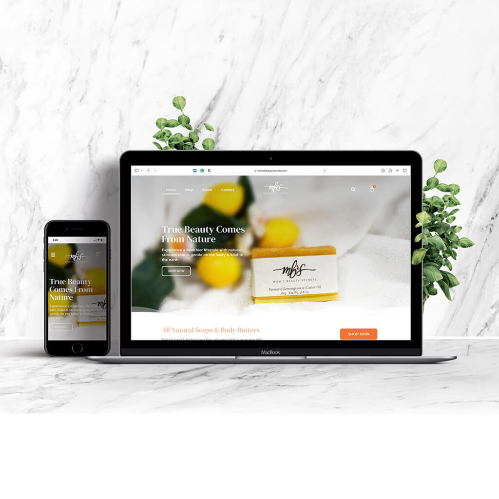
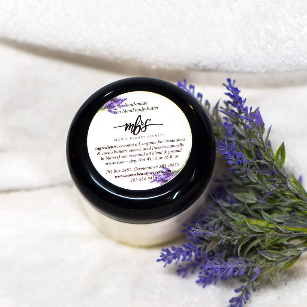
We started by refining the homepage design to create a better first impression for customers who visit the site. The messaging was refined to make it more conversational. A video testimonial was also added for social proof. The color scheme for the website is calm and gentle with a splash of orange to convey the feeling of being energized and moisturized. For the product photography, Apricot Branding partnered with Videogurus to develop the photoshoot and edit the new product images. The new images are brighter, cleaner, softer, and more modern. Each product description was also improved to really convey the experience and allow customers to understand the key ingredients and benefits of each product. A blog was added to increase engagement on the site. A free download was also created to make it easier to grow an email list of potential customers.
The new visual direction is cleaner, softer, and more modern with intuitive navigation that allows customers to shop more seamlessly and explore natural alternatives to their skincare needs.
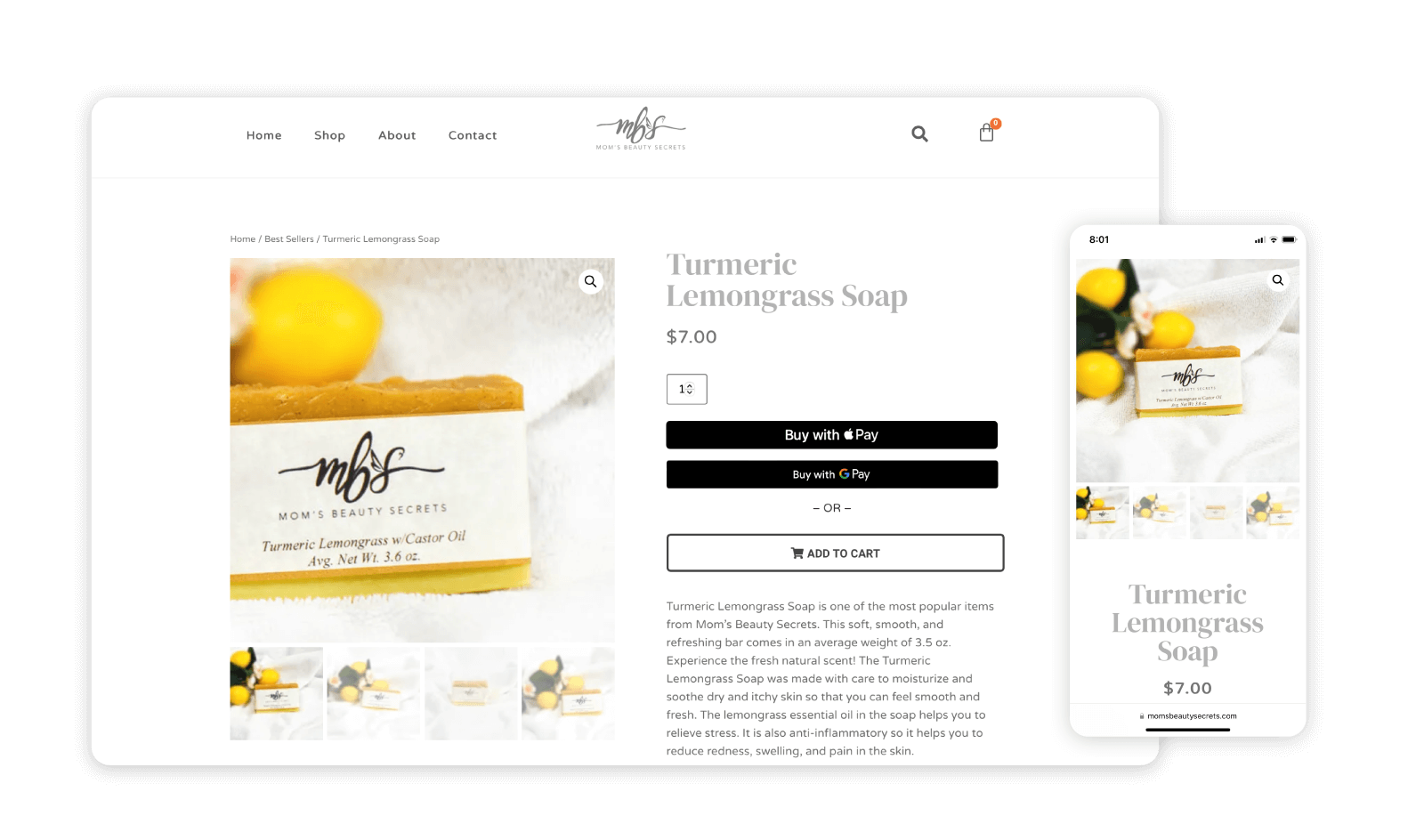
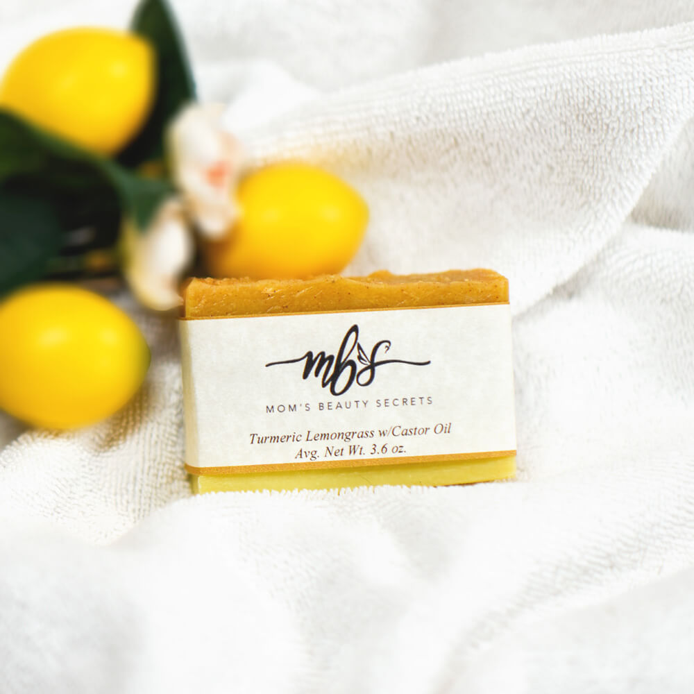
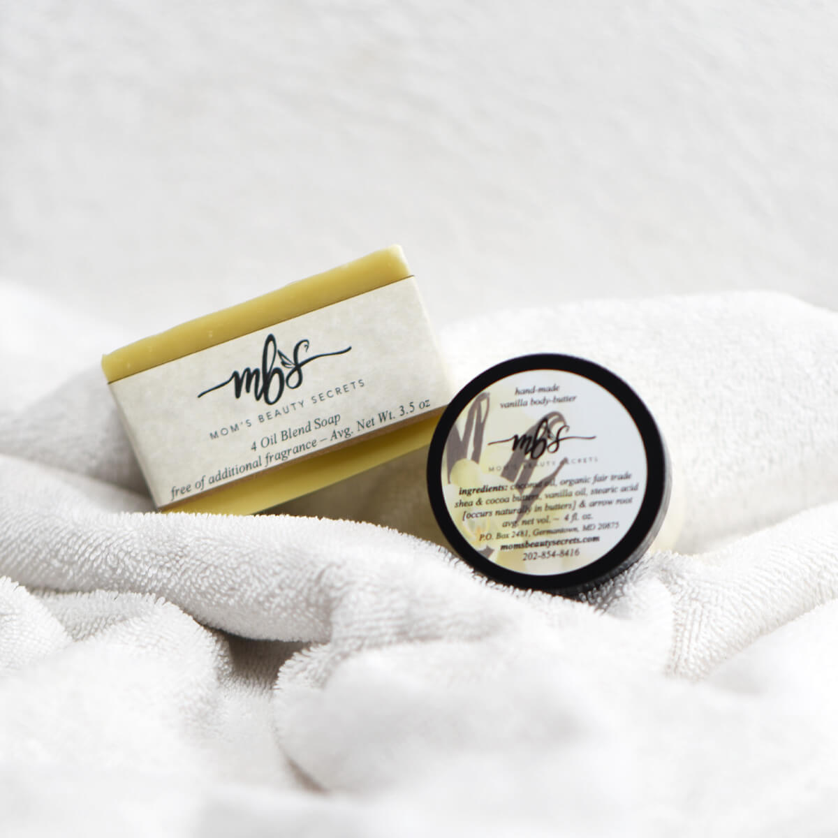
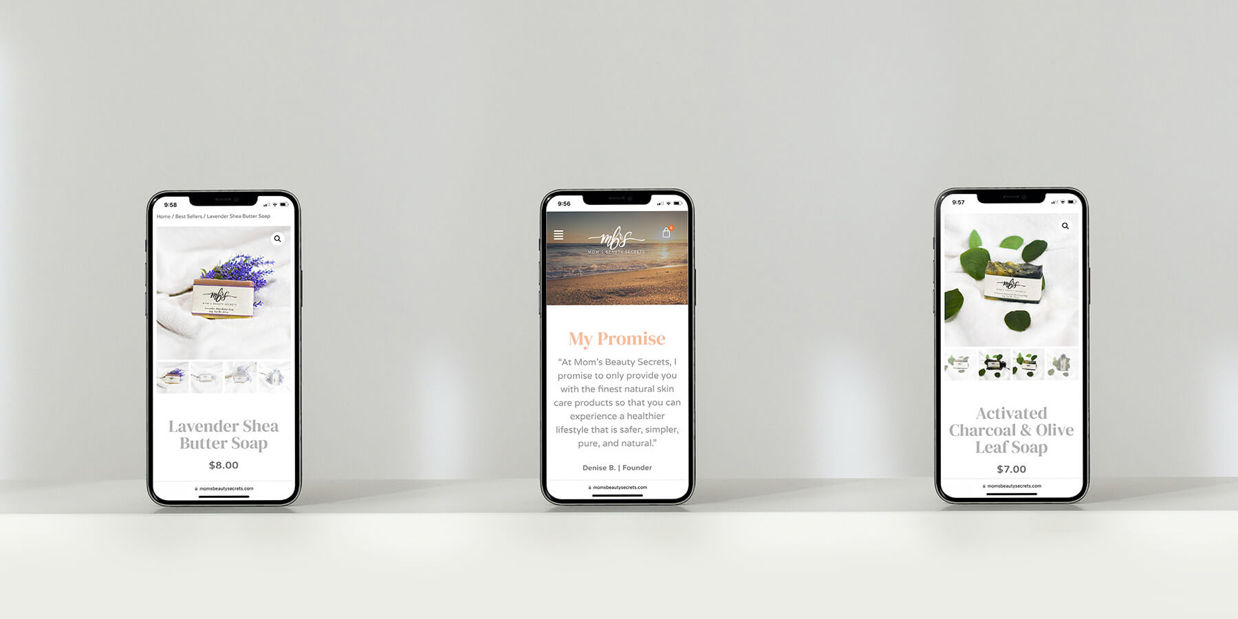
As a result, the business owner received very positive feedback from customers about how much the site has improved. After, the redesign, we were able to more than double the open and click-through-rates on the eblast that was sent to announce the release. We were also able to dramatically boost the website page speed from 16/100 on desktop and 1/100 on mobile to 93/100 on desktop and 53/100 on mobile! This would lead to a much better shopping experience and better rankings in the search. We added more payment methods like Apple Pay and Google Pay, as well as Venmo and Pay Later. Customers are now also able to create accounts for easier checkout. The site is now more engaging and we are now able to track how it is performing in the Google Search.
Would you like to work together?
If you would like to discuss a new visual direction for your brand or an e-commerce strategy, click below and let’s get in touch. It all starts with a free consultation.


