An Improved Shopping Experience for Natural Beauty Products
Saint Eden was founded to help women take better care of themselves. To educate women to buy better products that are safer for themselves and their family. It is an online marketplace that specializes in natural beauty products.
The Challenge
The ultimate goal was to be able to expand into more categories in the future and attract more brand partners. Upon doing a detailed review of the old website, we noticed that the design of the old website did not look credible or well-established and that would make it more difficult to attract potential partners. The old website had several large images and videos that were slowing it down, especially on mobile. The product images were very blurry. It was running an outdated version of Paypal that caused technical issues with payments. It was also not secure. Nothing was being done to maintain it and this also made it more vulnerable to hacking and other issues.
Target Audience: Women 25-65 who want to take better care of themselves with more organic or alternative medicine and lifestyles. Challenge is not having enough time and understanding to know what ingredients are good or bad.
Competitors: The Detox Market, Goop, Blk + Grn

The Solution
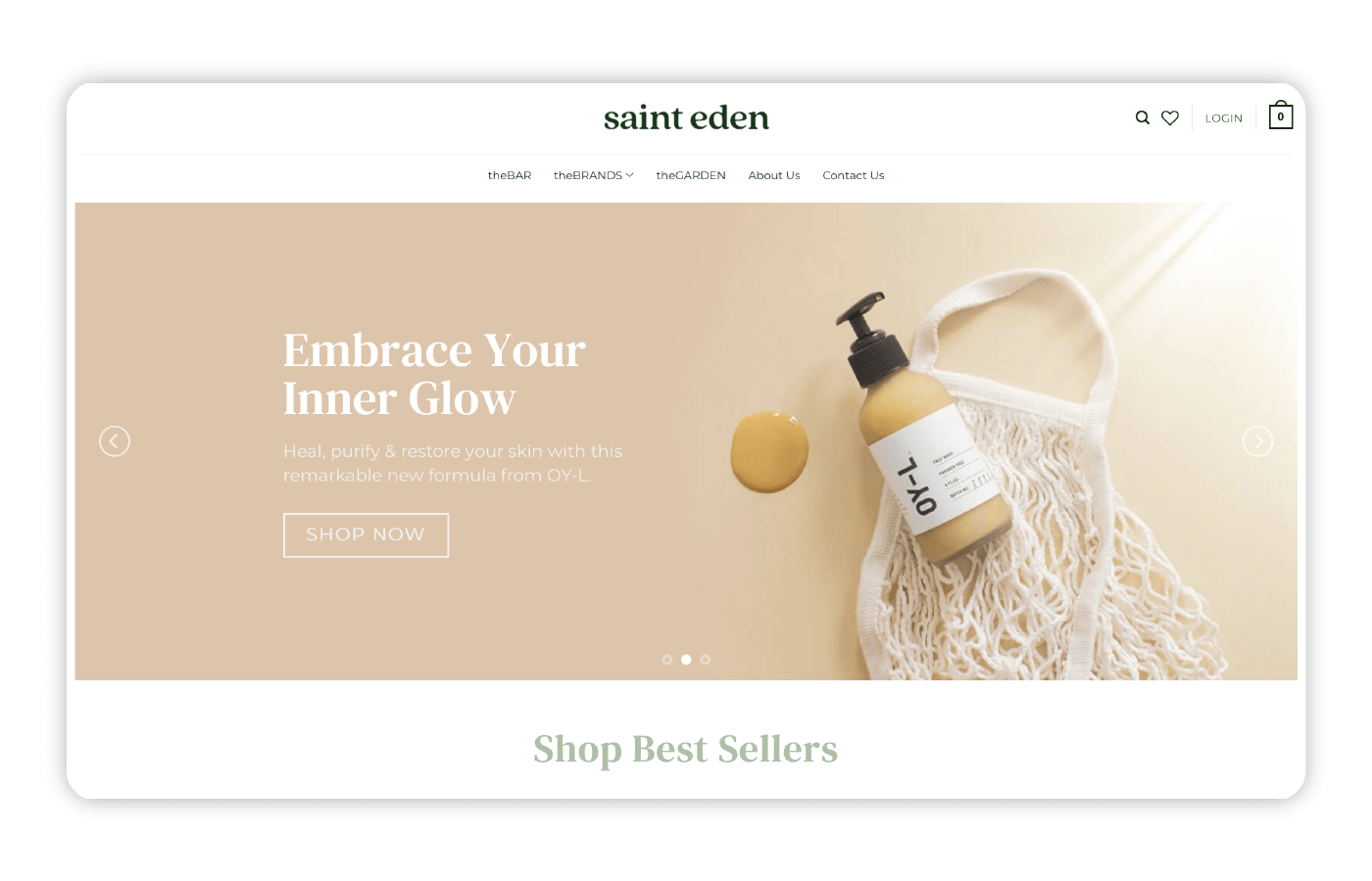
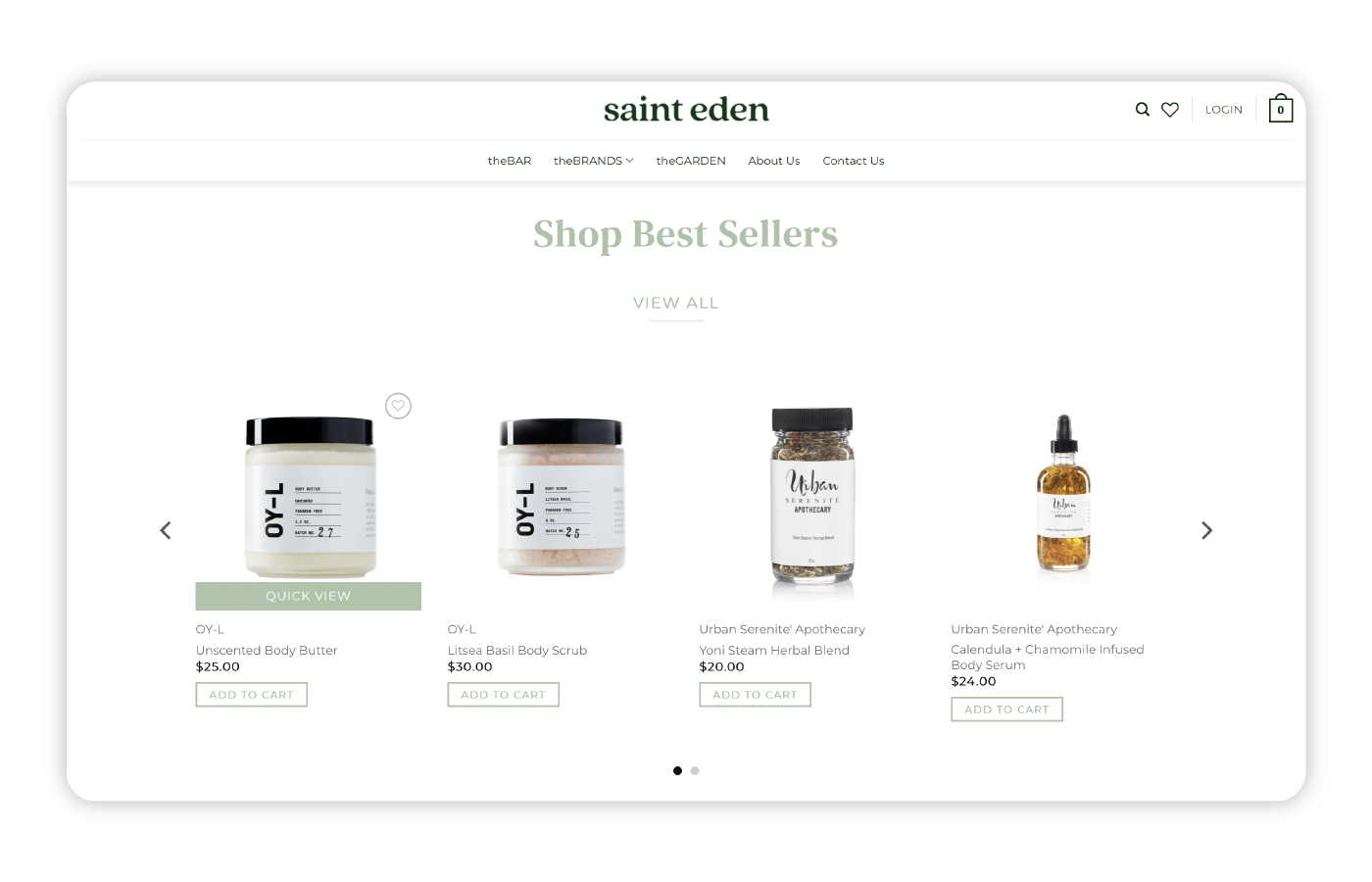
In order to revamp the website for 2023, we improved the homepage design and layout to make a better first impression to potential customers and partners. We added a search option and wishlist to the top header to make it easier for customers to find what they need. We improved the product image displays to make them more crisp and clear. We added more payment methods for customers to choose from and gave customers the ability to shop by brand. We were able to speed up the website and this would further improve the overall shopping experience. The blog was also improved along with the online store and homepage.
The new visual direction for Saint Eden balances both aesthetic quality and improved functionality to ensure a memorable shopping experience that prepares the brand for 2023 and beyond.
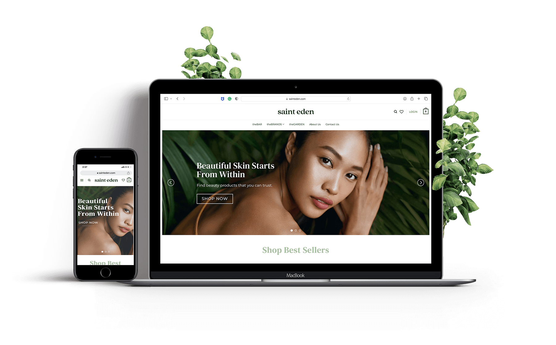
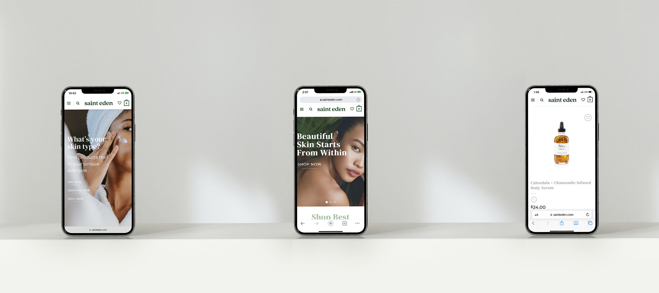
Overall, the project was a success and we were able to increase the page speed score on google from 45 to 73. Customers can now enjoy an improved shopping experience with multiple payment options at checkout. The next steps would be to drive traffic to the site through both paid and organic channels. The new visual direction will now make it easier to attract larger partners because it has been raised to a higher standard. To take a look at the new website, feel free to visit, sainteden.com
Would you like to work together?
If you would like to discuss your e-commerce strategy or a new shopping experience for your customers then click below and let’s get in touch. It all starts with a free consultation.

