visual branding case study for a local non-profit, tackling homeless
Raising Awareness for ReCoup, Inc.
ReCoup, Inc. is a 501 c3 nonprofit with a mission to provide the homeless and hungry with opportunities to recoup and reclaim themselves as they work towards a more sustainable future.
The Challenge
ReCoup, Inc. needed to raise funds to help lower income people and communities with food, clothing, money and support. The goal was to be able to attract both personal and corporate donations and grants so we needed to make it easier for people to identify, remember, and learn more about ReCoup, Inc. They needed a new visual direction to present ReCoup, Inc. as a well established organization and they needed an online presence where people can visit to learn more and also show support by donating. They also needed help with deciding on the right fundraising tool for collecting donations so ReCoup, Inc. partnered with Apricot Branding to help launch their digital presence.
Similar nonprofits: DC Coalition for The Homeless, Project Plase, Joy Baltimore.
The Solution
After an initial consult, We conducted a competitive analysis of similar non-profits to ensure that the new visual direction for ReCoup, Inc. is clearly differentiated from others. The next phase was to craft the core values and identify the key attributes and strengths of ReCoup, Inc. before developing a visual language to reflect these attributes. This allowed us to launch the online presence for ReCoup, Inc with a more effective approach to design and messaging that helps them to meet their fundraising goals.
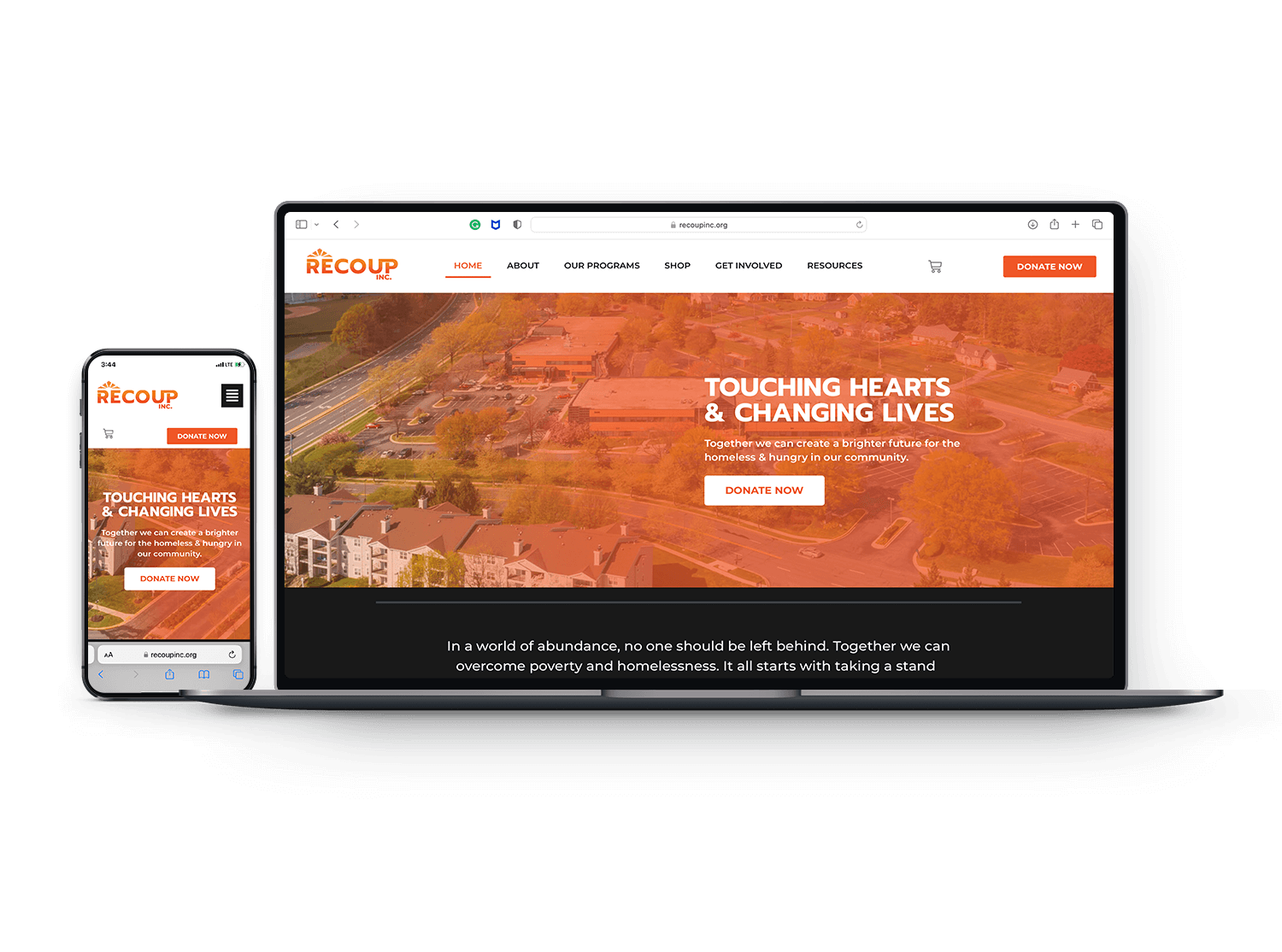
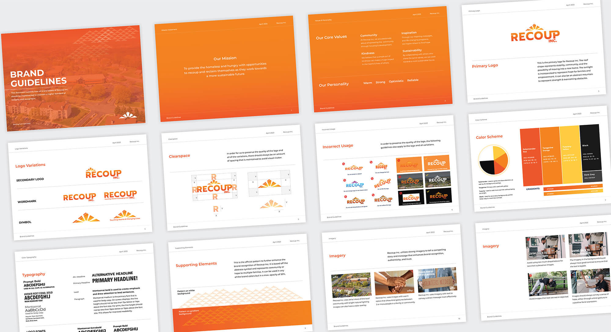
A set of brand assets and guidelines were developed to help ReCoup, Inc. to maintain a cohesive and recognizable visual language in both online and offline channels. A new tagline of Touching hearts & changing lives was also developed to reflect the mission and all that they do for the community. Research was done to understand the state of homelessness in the US and the data was used to develop compelling website copy to convince people to donate. We integrated Donorbox and Printful as part of our fundraising strategy to provide supporters with more flexible donation methods. We also included a blog on the new website to improve engagement and SEO rankings. These posts can be promoted on social media to drive more people to the site while starting a conversation around homelessness.
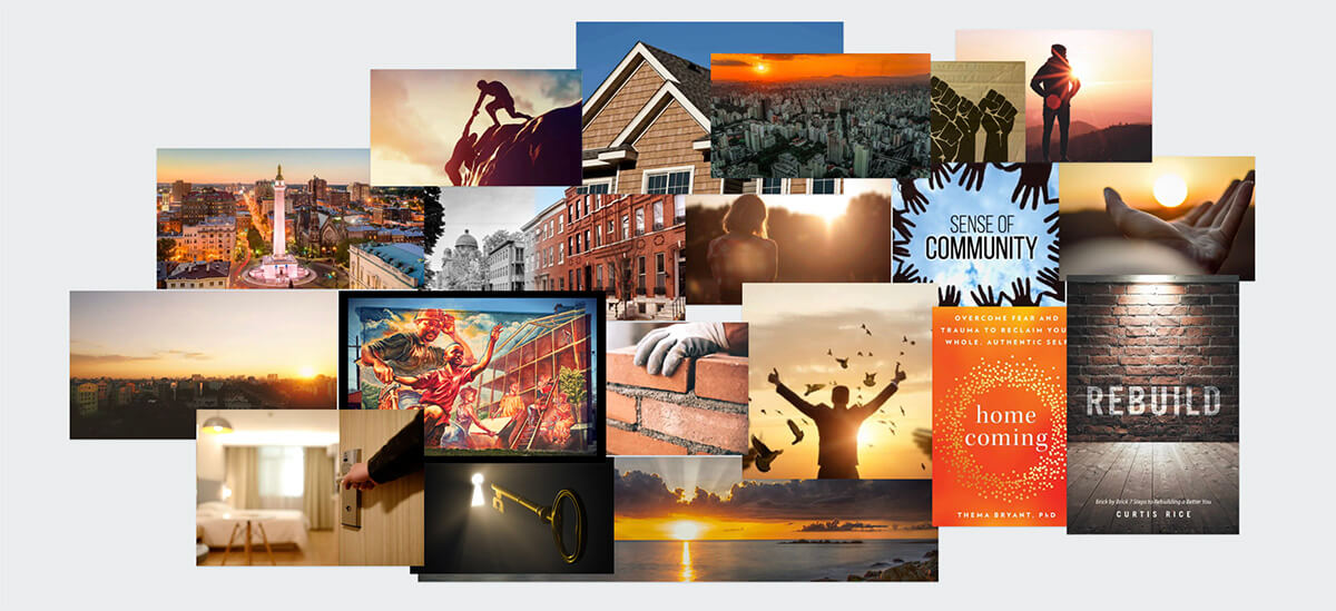
The new visual direction for ReCoup, Inc reflects their mission to provide the homeless and hungry with opportunities to recoup and reclaim themselves as they work towards a more sustainable future. It combines an abstract roof or mountain to represent stability, and the possibility of moving into a new home while the sunlight and optimistic color scheme represents hope for families and empowerment.
As a result, ReCoup, Inc. was able to secure up to $10,000 per month in Google Ad grants within 3 months from the website launch because of the level of quality and professionalism that went into the development of the new website and visual language. In order to qualify for the grant, their website and brand needed to look like a well-established organization and this was what we were able to help them accomplish. The next steps would be to raise awareness via social media, google ads, and local events. To learn more about ReCoup, Inc. feel free to click here to visit the website.
Would you like to work together?
If you would like to discuss a new visual direction for your non-profit, click below and let’s get in touch. It all starts with a free consultation.