Financial Futures 1st is an insurance professional and retirement firm that helps clients set financial goals and select the right insurance coverage plan to protect them and their families. It is an E & O insured entity with a variety of financial products to fit your needs and budget.
The Challenge
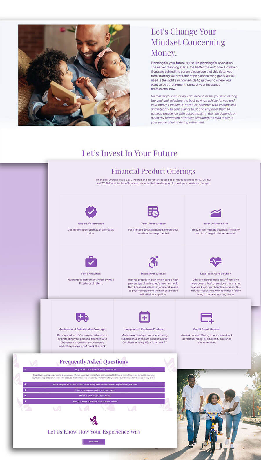
The company needed a visual re-vamp that would include a brand identity re-design and website design to launch their online presence. It needed to clearly convey the value offerings that range from life insurance to fixed annuities. Credit Repair courses are also offered to help customers manage their credit score and eliminate debt. The client also needed support with social media and google business setup.
Target Customers: Young moms and couples buying a house, down-to-earth, family-oriented people looking to build, gain financial literacy and pass it down.
Insight: From research I found that people tend to not see the need, benefit or urgency to do retirement planning if it is perceived as too broad or vague.
The Solution
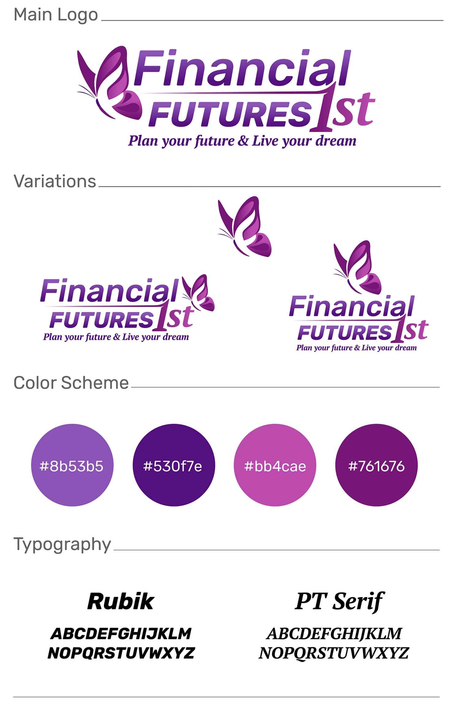
For the design direction we decided on something more down-to-earth. Inspiration comes from family and the experience you get from being financially free. The butterfly was chosen as the symbol because of how it conveys the theme of empowerment, transition and relief or the freedom of living your dreams. It also scales nicely at smaller sizes.
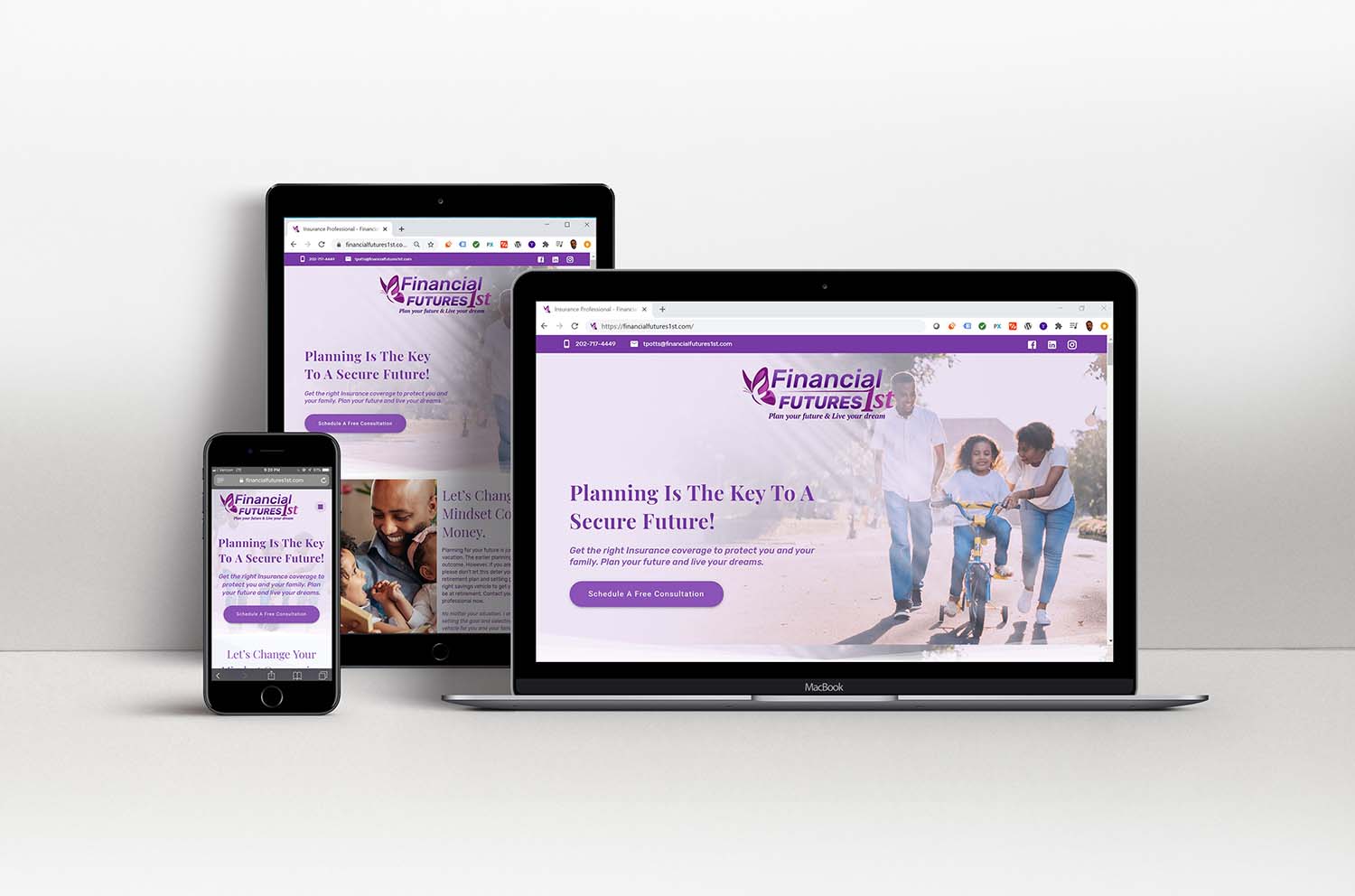
The business website design was created with the intention of taking complex concepts and displaying them in a way that is easy to understand. The website is responsive and allows people to easily schedule appointments. The website starts with the phrase “Planning is the Key to a Secure Future” as the header. This effectively summarizes the value that the brand offers. It was also chosen because of the emotional positive sentiment that it evokes. The hero image portrays one of the target customers: Young parents starting a family. The sub-header goes more in-depth on the value and why it is important. Beneath the sub-header is a button that links directly to the scheduling form.
The inspiration behind the brands visual identity comes from the feeling of being financially free and the logo reflected that theme of empowerment, transition and relief or the freedom of living your dreams.
To learn more about financial futures first, feel free to click here to connect on instagram.
Would you like to work together?
If you are looking to launch your brand online and would like to discuss a new visual direction, click below and let’s get in touch. It all starts with a free consultation.