Reviving A Women's Healthcare Brand
Breastfeeding Perspectives is a lactation consulting company that provides a modern, unique and pain-free solution to solve your lactation needs. After 15 yrs of being in business, it was finally time for a brand refresh to look cleaner and more modern.
The Challenge
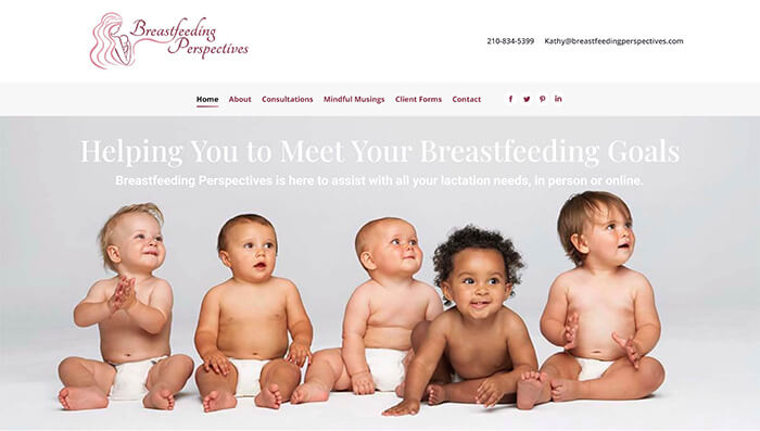
The client as looking for a brand refresh to prepare for the new year. The old brand did not clearly convey the calming and soothing experience of the service. The old logo looked too busy and it did not fit the younger target group. It also needed to work better on any size as well as social media. The project included a complete website redo on a new hosting provider. The old website was slower and more clunky. It had several blank pages with lorem ipsum and empty galleries. The client was also looking for a solution to allow people to easily book and pay for consultations virtually, online or in person.
Target Audience: New mothers in San Antonio, TX and surrounding areas. Companies that need lactation coverage as an employee benefit.

The Solution
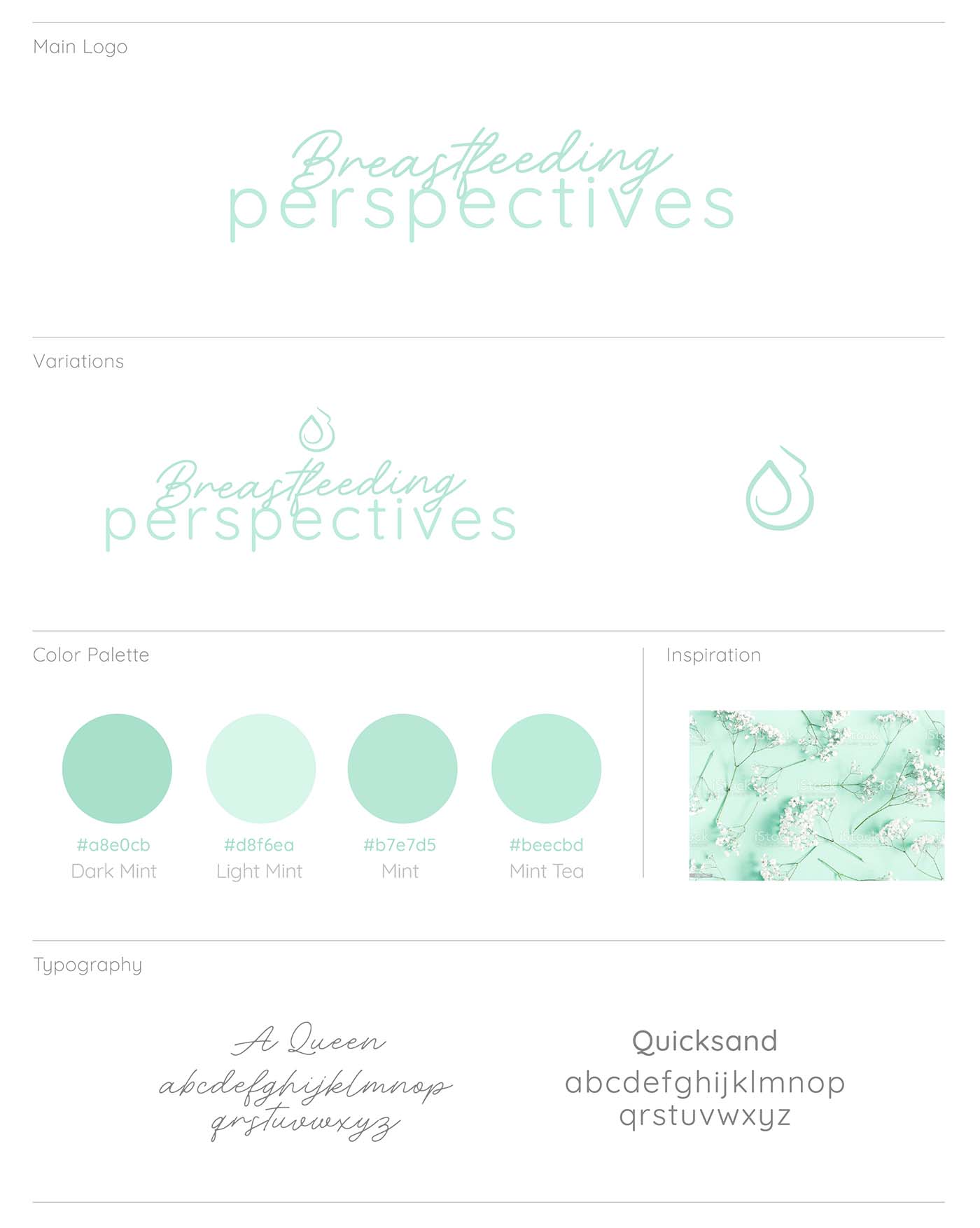
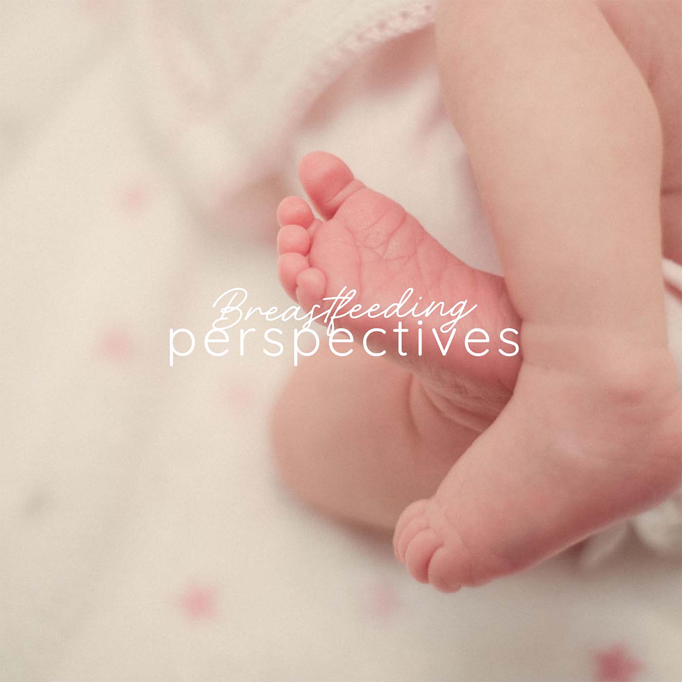
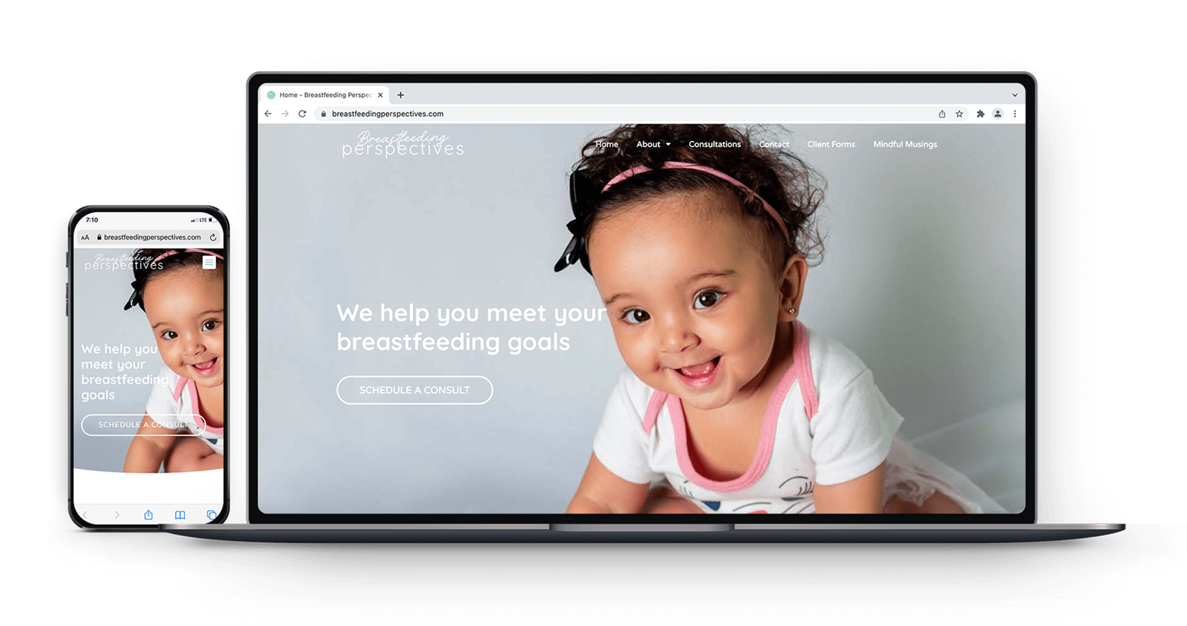
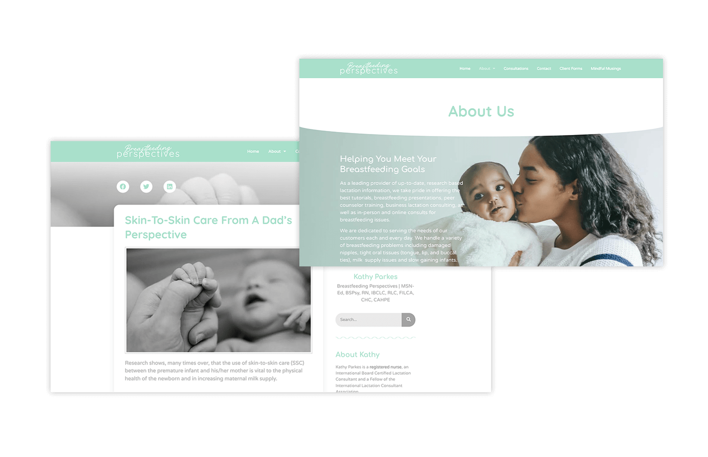
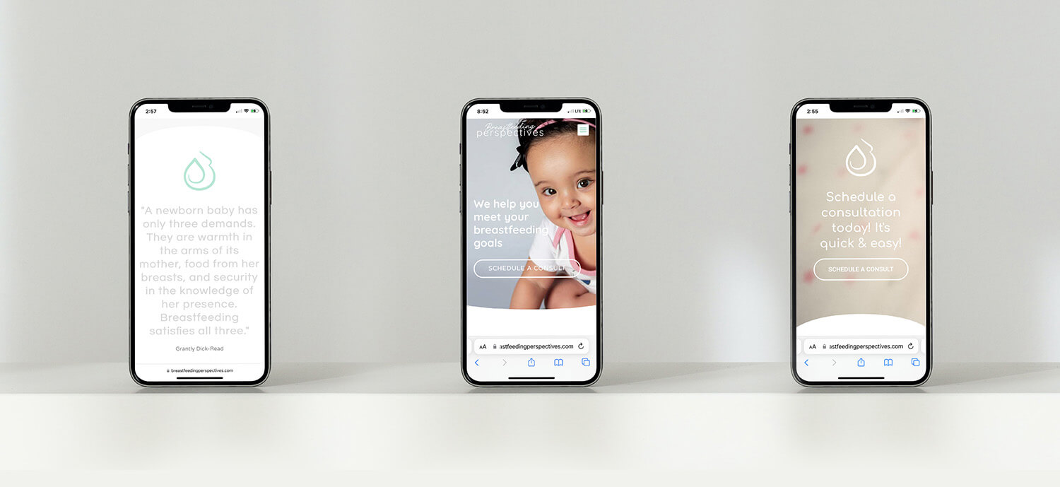
In order to revamp the brand for 2022, Breastfeeding Perspectives needed a whole new visual direction that will grab people’s attention and create a more emotional first impression. It needed to convey the experience of being pain-free as well as comfort, relaxation and relief. It needed to be soft and comforting but bright and optimistic. We were trying to avoid a brand that looks too masculine or too medical. The new aesthetic direction is cleaner and more minimal compared to the previous. This allows the brand to stand out as a more modern healthcare provider.
The new visual direction for breastfeeding perspectives is cleaner, modern and minimal. It conveys the value of relief, comfort and relaxation that customers experience.
Old Website
New Website
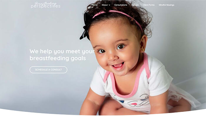
Overall, the project was a success and the client was able to get customers to pay directly from the site for the first time. The self-scheduling and payments system has been very successful. The client is now usually booked with a handful of customers at least a week ahead because of the visual appeal and intuitive functionality of the new website design. She has now received a lot of positive feedback from customers. We were able to increase the page speed score on Google from 51 to 97! The site was also listed in more local directories and through an effective content strategy we propelled the website to the first page of Google and grew her organic website traffic by 123%+ within the first quarter alone. This led to an increase in daily subscribers that fit the target audience. She is also now able to easily track how the website is performing in Google Search. You can now visit the site at breastfeedingperspectives.com
Would you like to work together?
If you would like to discuss a new visual direction for your brand, click below and let’s get in touch. It all starts with a free consultation.
