Repair Nimbus is a cellphone and tablet repair business in Michigan looking to branch into computers and other IT related services in the future.
The Challenge
They were looking for a new visual identity that would include a full style guide as well as a vehicle wrap layout and business website with a design approach that fits the target customers and helps them stand out.
Target Customers: Busy moms at work or parents at home looking after kids or working at home. They may lack the time and technical skills to get their broken devices fixed so this could drastically affect their daily schedule if their devices are having technical problems. Repair Nimbus makes it more convenient for them with on-site services at their location.
Competitors: ubreakifix, Experimac, Michigan based cellular repair centers.
The Solution
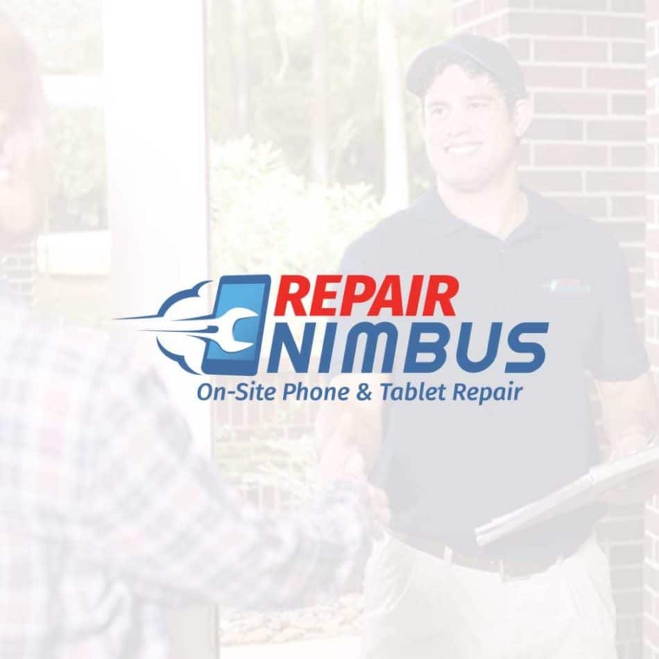
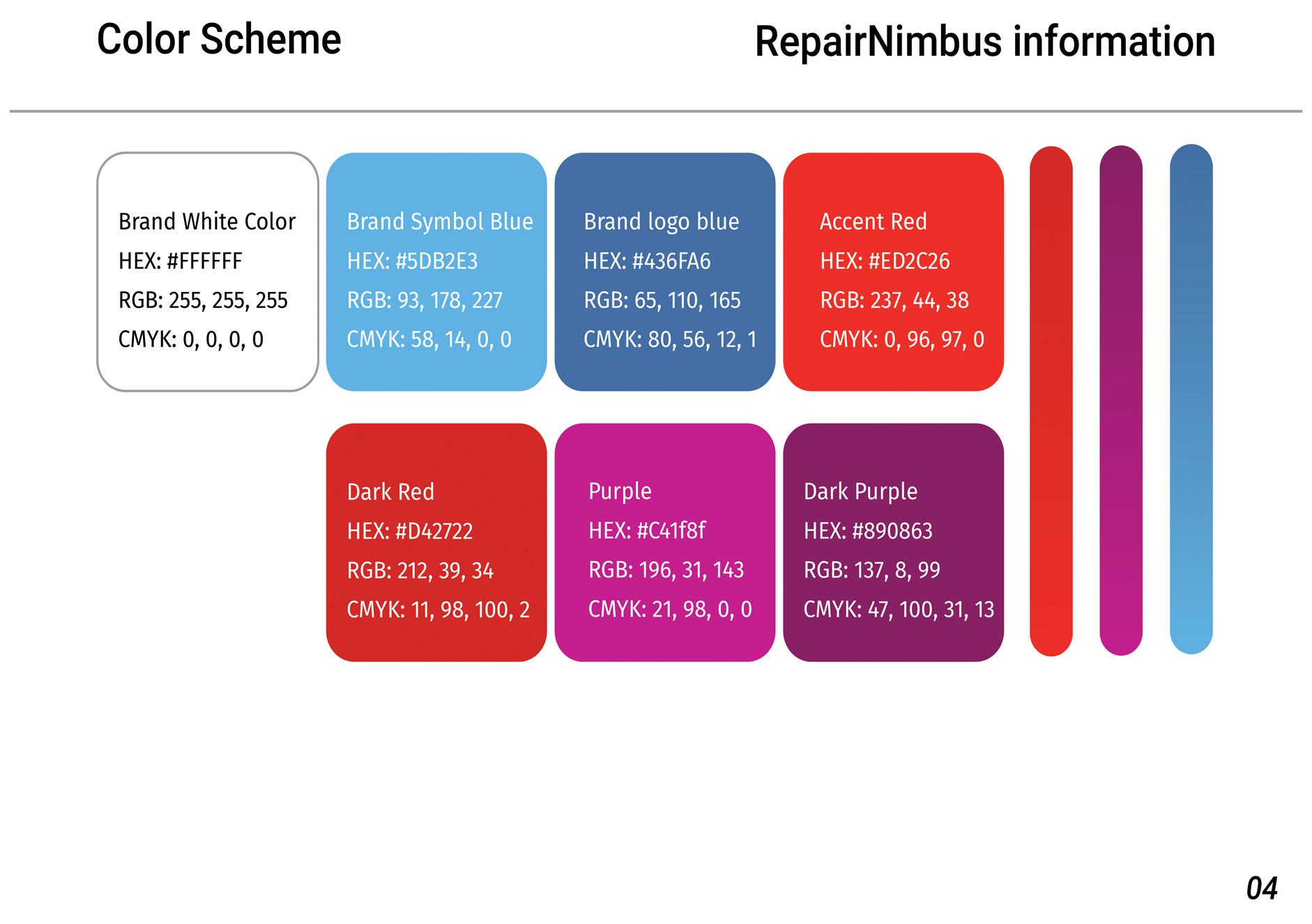
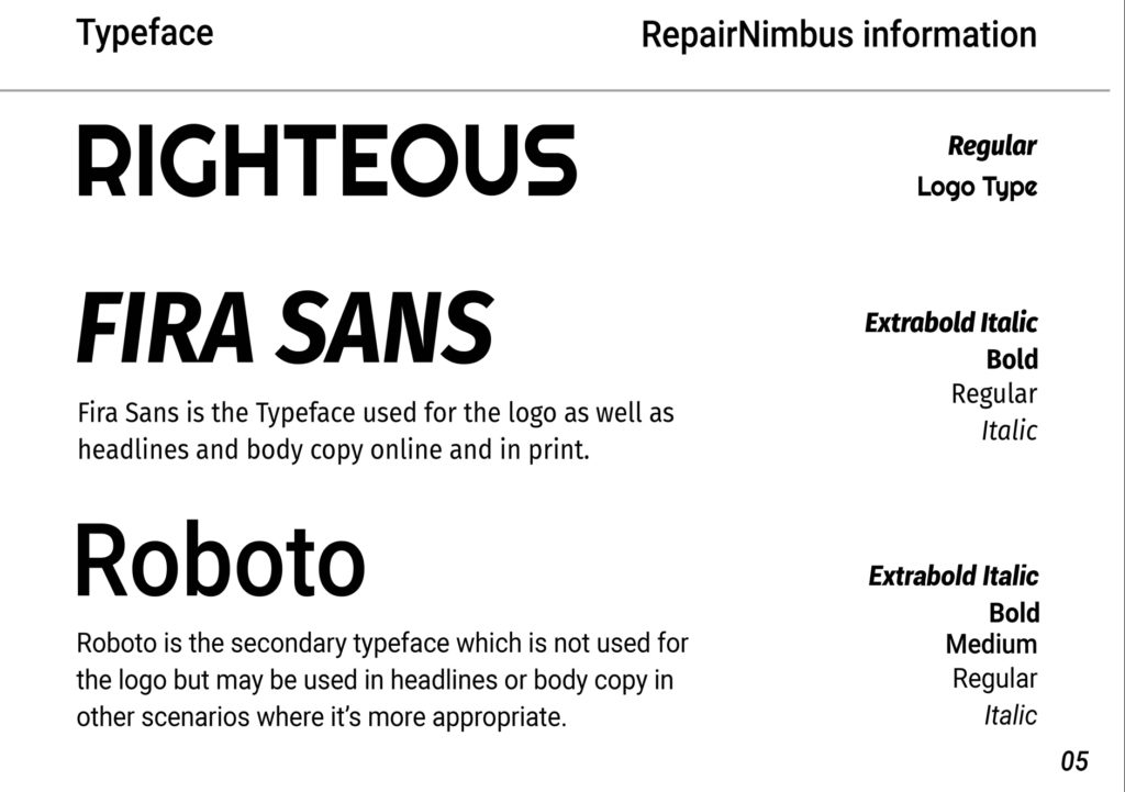
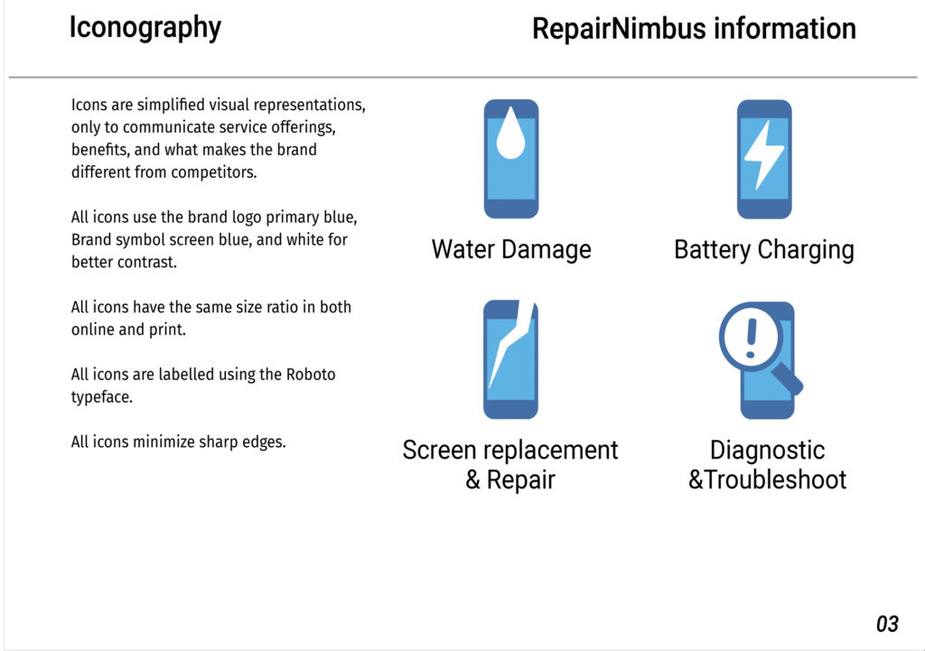
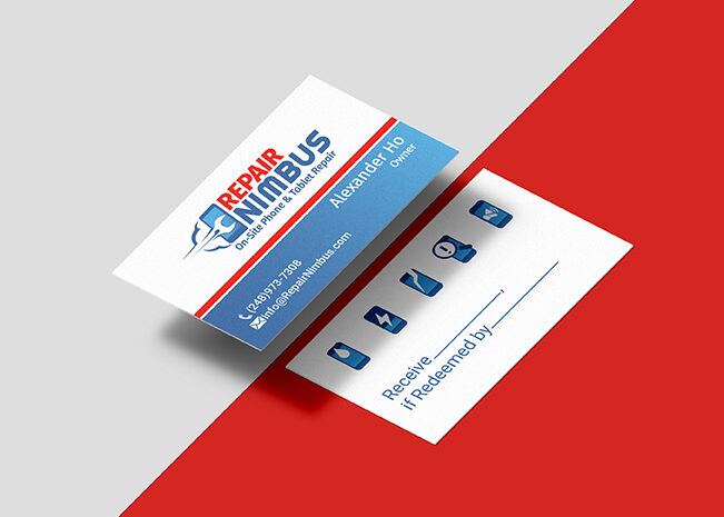
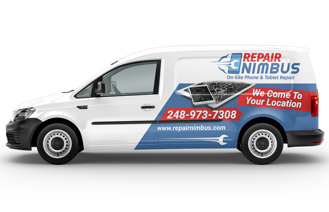
We decided on a solution that allows it to meet the standards of other well established brands. The blue is used to express competence and safety while the red highlights the word ‘repair’ and makes it easier to see at night. It also incorporates a tool into the negative space and uses line to evoke a sense of motion for speed and efficiency. A style guide was also developed with details on the how we can use design more effectively in both print and online.
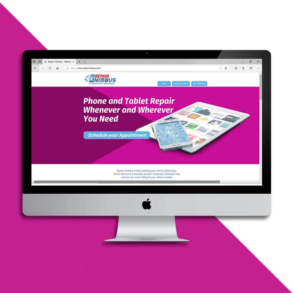
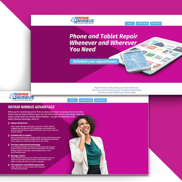
The next phase in the project was to develop their online presence. For the home page hero we decided on an effective headline that expresses the value proposition of the brand and a call to action that links to Acuity scheduling. For the website, we aimed for a look and feel that is mature and feminine in order to match the target customers. That influenced the color scheme and imagery that was used as well as the tones.
The new visual direction for Repair Nimbus conveys the efficiency of the repair solution and allows it to launch online with a clear and concise message.
As a result, The new visual identity allowed the business to more effectively launch online and offline with a clear message and distinct visual appearance.
Would you like to work together?
If you would like to discuss a new visual direction for your brand, click below and let’s get in touch. It all starts with a free consultation.