Smokin Aces Bistro
Smokin Aces Bistro is a premium barbeque business based in florida that offers homestyle cooking and southern style cuisine
The Challenge
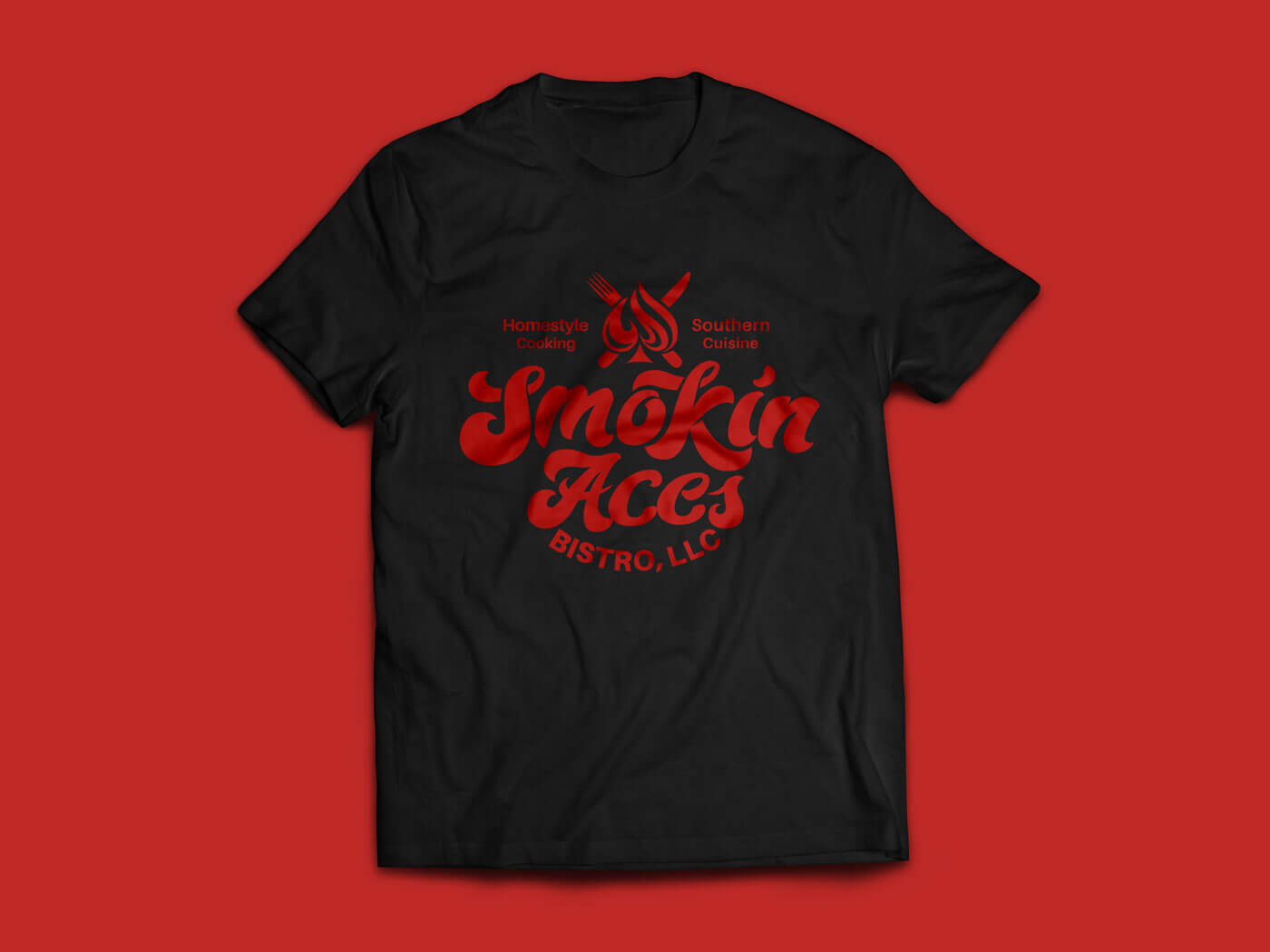
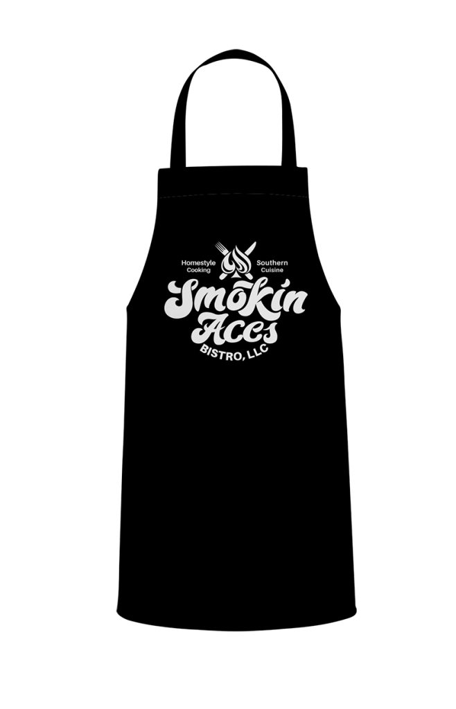
The founders of Smokin Aces Bistro were looking to launch the brand and hopefully expand into a restaurant in the near future. They needed a visual identity that would stand out as unique and eye-catching. The catering logo would need to emphasize the boldness as well as the premium quality of their cuisine and visually present them as the best. The brand identity design will extend into aprons, signage, foodtrucks and merch, as well as websites and social media. Their main goal was to be different. They didn’t want to look like any other basic burger joint. They were also looking to avoid the franchise look. They were looking to communicate that Smokin Aces Bistro is number 1 in the city.
Competitors: Monroe Smokehouse barbecue, The Soul Food Bistro, Gators Dockside
The Solution
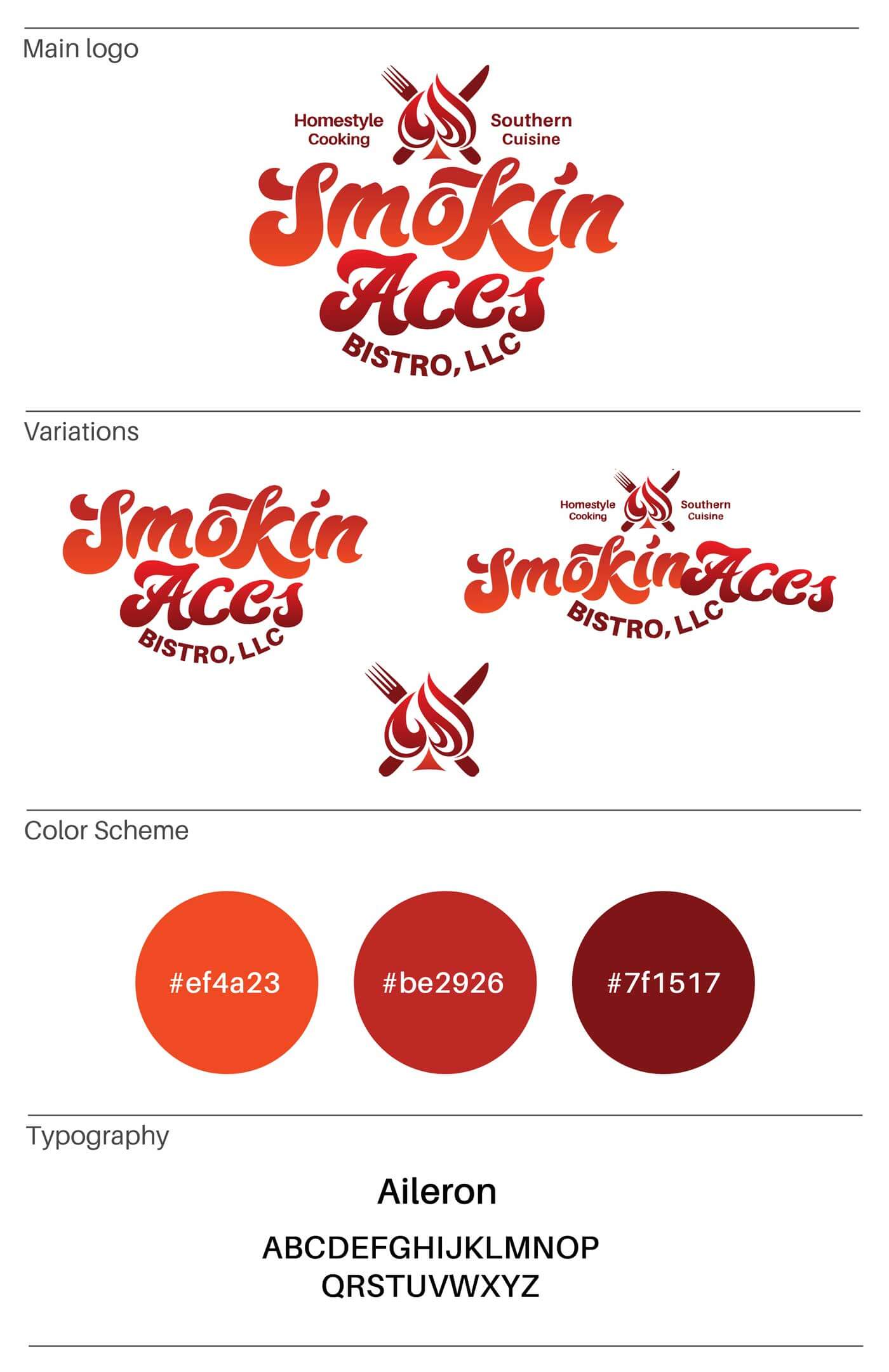
The logo needed to make a bold statement, be exciting and represent the good times while being clean and professional. The wordmark uses very bold letters that are fully custom with a retro style. The letters also have a sense of movement and flow nicely together. The custom lettering is paired with the Aileron typeface which is a Neo-grotesque sans-serif. It was chosen because of its simplicity and legibility. It was also slightly customized to look more balanced.
The color scheme uses very lively and fiery tones inspired by the flames of a bistro grill. The tones bring life and vibrance to the visual identity design. The name and integrity of the brand is reflected through the symbol. It incorporates a fiery ace that is rendered in a very stylized and unique way. A fork and knife is added to show that it is a catering logo upon first glance. The symbol is also very scalable. Overall, The new visual identity design is very bold and lively but visually balanced
The new visual identity design for Smokin Aces Bistro makes a very bold statement and reflects the premium nature of the brand. It shows the dedication to quality that allows the brand to stand out from other bistros as a leader in southern style cuisine and hospitality.
In conclusion, the project was a success overall. The brand is now ready to launch with a fresh new visual identity. The next phase in the project would be to develop vehicle wraps and other forms of advertising. There is also the potential to launch another extension called ‘Holistic Bistro’
Would you like to work together?
If you would like to discuss a new visual direction for your brand, click below and let’s get in touch. It all starts with a free consultation.

